Skip to content

Welcome to Pixelated Penmanship! ✒️💾

PLP Jumbo Review... A Comfortable Jumbo With a Questionable Nib

A Great pen for everyday use for someone who prefers a large pen, Just spec yours out wisely

When you think of an Indian pen, the first thing that comes to mind is a relatively large pen, made of ebonite, resembling old Parkers or Swans, that are filled by an eyedropper, and often came with a wide range of nibs. Thankfully, due to nostalgia, or refusal to change, those kinds of models are still available today, for better or for worse. But nowadays, the pen landscape has changed significantly. With changing needs of the consumers, we had a period of some innovation, well... when I say innovation, the biggest development that had happened in the wider Indian pen landscape in the past 10 years has been the introduction of the so-called 3-in-1 pens, where the pens are made like they were used to, by hand. But instead of the friction fit nib and ebonite feed combo, they now use a screw in nib unit with a plastic feed, most commonly coming from JoWo. Then there are pen makers like Lotus, Fosfor, and the like that have made great innovations in the Indian pen scene, but they're a bit too niche for the general public. Then there's the likes of MagnaCarta who is now mostly focusing on overseas markets. For us budget conscious people, our palette remains mostly the same, ASA, Kanwrite, Click, PLP, Woodex, and the like. with the latter two being relatively new to the scene. Being OEM makers before and now have gone independent, using the same 3-in-1 formula, but incorporating new designs catering to their customers, Woodex in particular, has almost 65+ kinds of pens in their catalogue! PLP has focused on giving value for money offerings and catering to the customer's needs in terms of customization. Both of them, along with ASA, in my opinion are now the go-to when it comes to ebonite pens for a budget. With that intro out of the way, let's get on to the meat and potatoes, the pen I have on hand. From PLP , the jumbo. Introduced in mid 2023, it has been a fan favorite, with many theories also suggesting that this is the same pen as the Gama Madras, with the difference being that the Madras being made of SEM ebonite from Germany, and the PLP being made of Indian ebonite. I bought my first one at the time of release, in red ebonite with a Jowo Broad, and it immediately became one of my go-to jumbo pens. I liked the pen so much that I bought one this year. About a month ago, I placed my order of a second PLP Jumbo, this time, inspired by some of the kim pens that have been resurfacing in pen groups recently, I asked Satish Ji, the owner of PLP pens, to make mine in a flat-top, with an Ambitious #40 nib. And this is the pen that I'll be reviewing. Without rambling more, let's get on with it.

TL:DR

If you want a practical everyday jumbo pen that's great value for money, this fits the bill perfectly well. It's not absurdly big that you feel like writing with a cricket stump, but comfortable enough to be used for long writing sessions. Just avoid the ambitious #40 nib unit, and instead go for the #40 nib friction fit with an ebonite feed for eyedropper use only. If you want the ability to use cartridges and converters, go for the smaller, but still comfortable Jowo #6 nib units.

Build and Design

In one word - Cantankerous. The pen is built like a tank and goes well with the name jumbo. I chose the teal and black colorway of the ebonite, and I do really like the subdued nature of this colorway. The pen feels girthy but totally manageable.
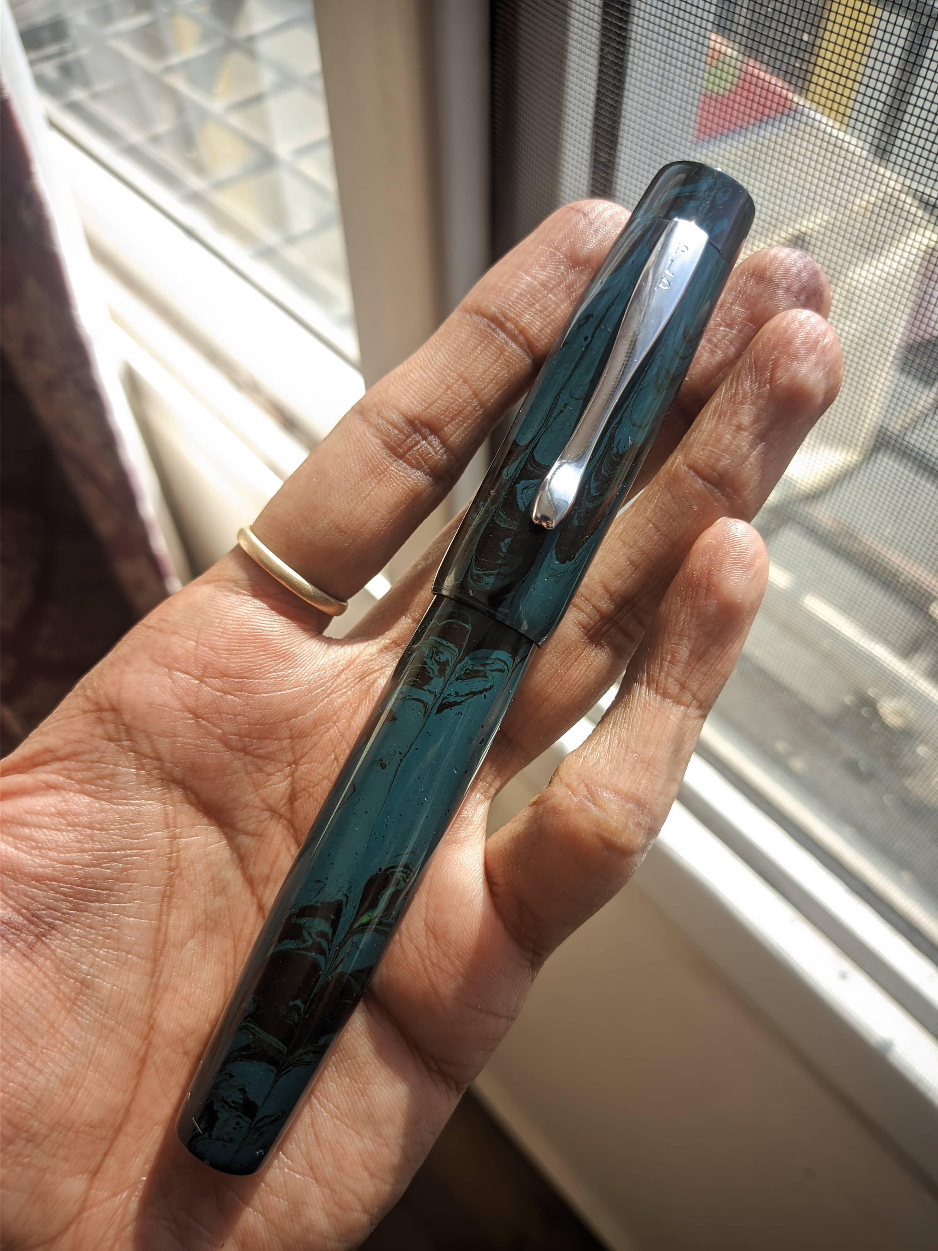
Image Description

Coming to the design, as I said, I customized mine to be a flat top variant, instead of their typical round top variant that they sell. And the pen has a classic appeal. The design is simple, the proportions are great. Coming to the features, starting from the cap, the finial is flat that then transitions into the cap, with a slit through which the clip is fitted. The clip is an appropriate size for the pen, and the PLP logo is stamped on the top section of the clip. The cap then tapers up a third of the way before straightening out towards the end of the cap, where we are met with a step down to the barrel. The barrel then continues straight till about two-thirds of the way before it starts tapering down to meet at the rear end which is also flat.
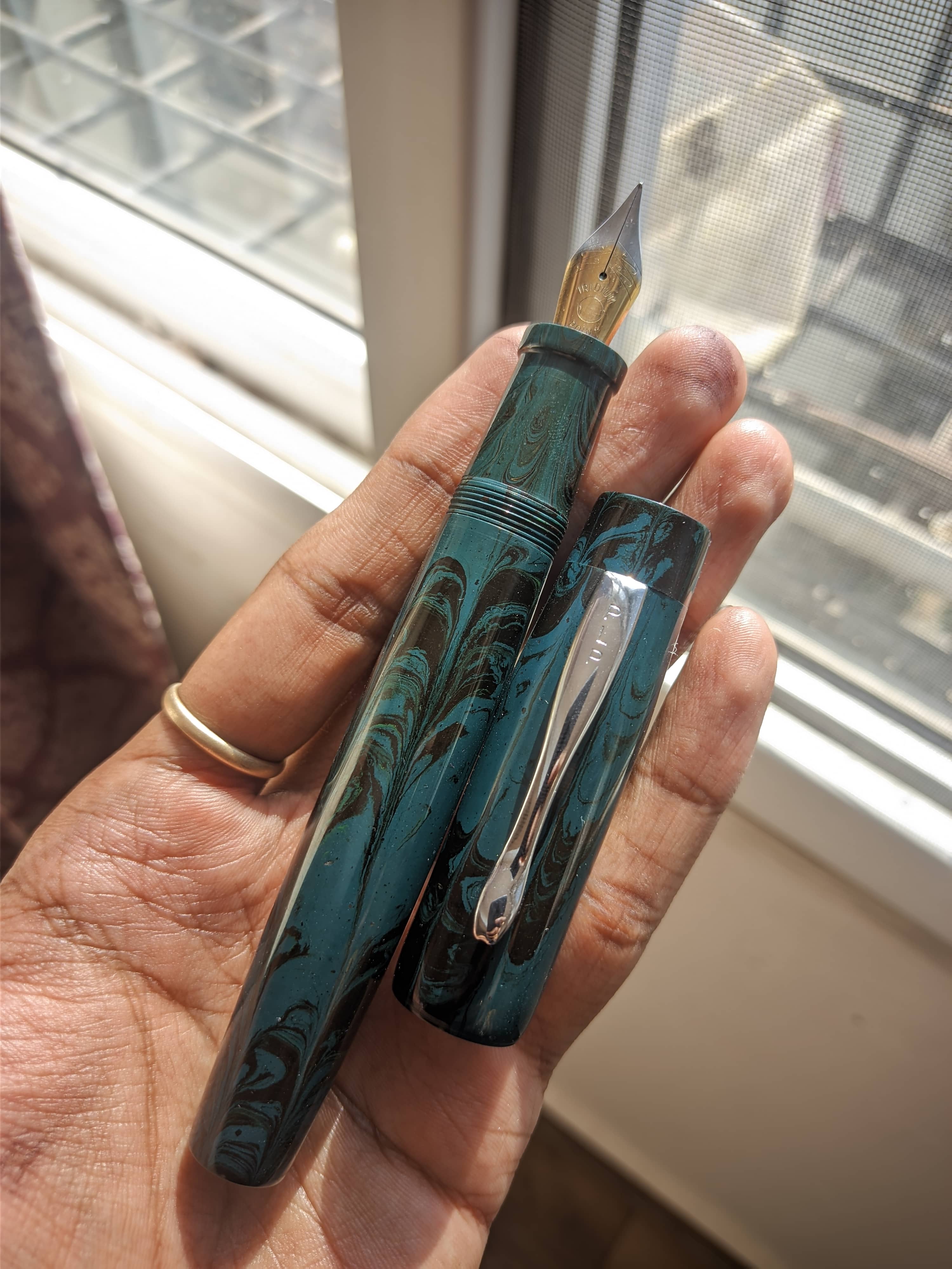
Image Description

Coming to the section, it's again, a classic design with a small taper and a ledge to prevent your finger from slipping out the section. The grip is comfortable to hold. However, smaller hands might find it a bit too wide for them.
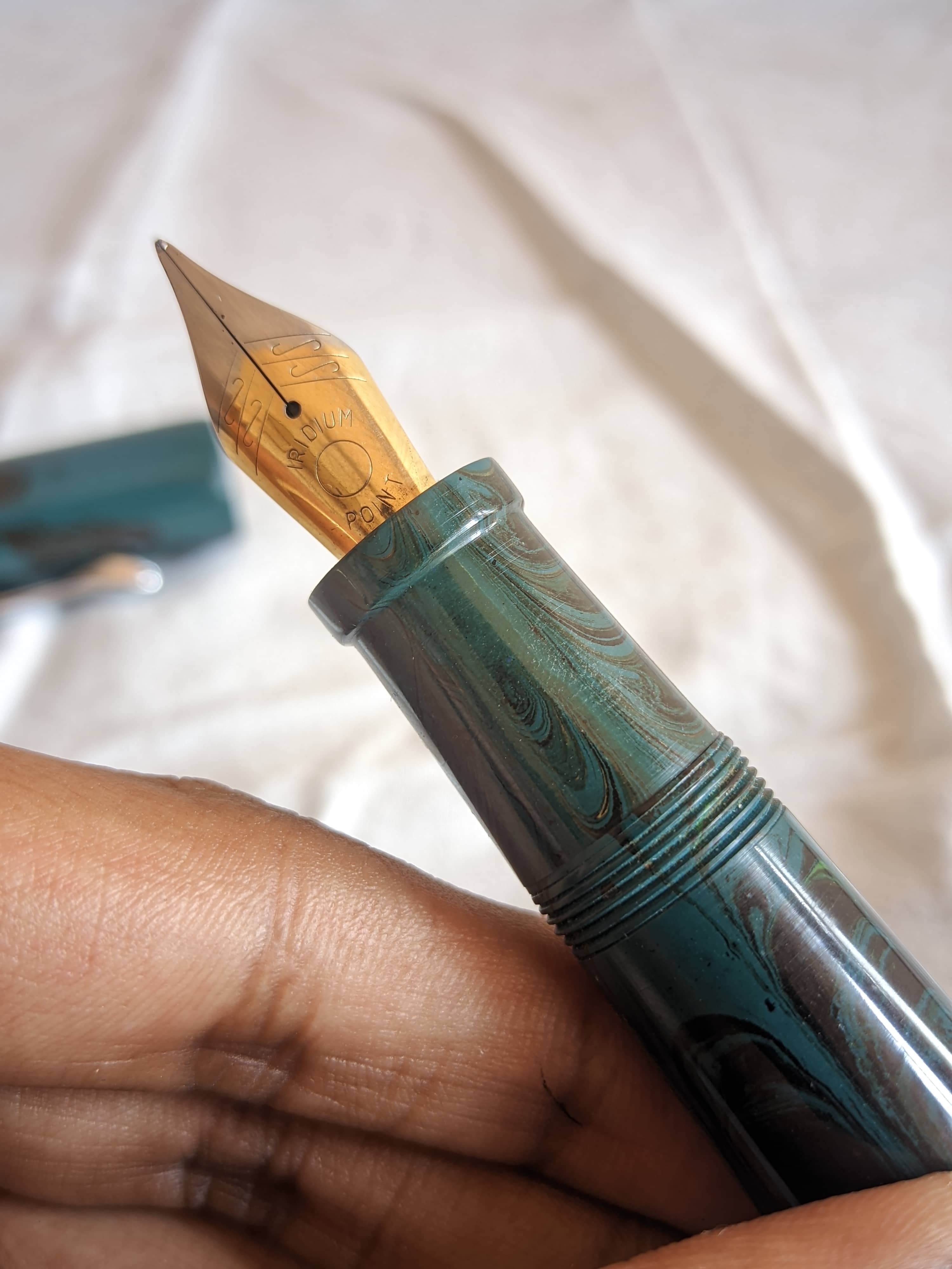
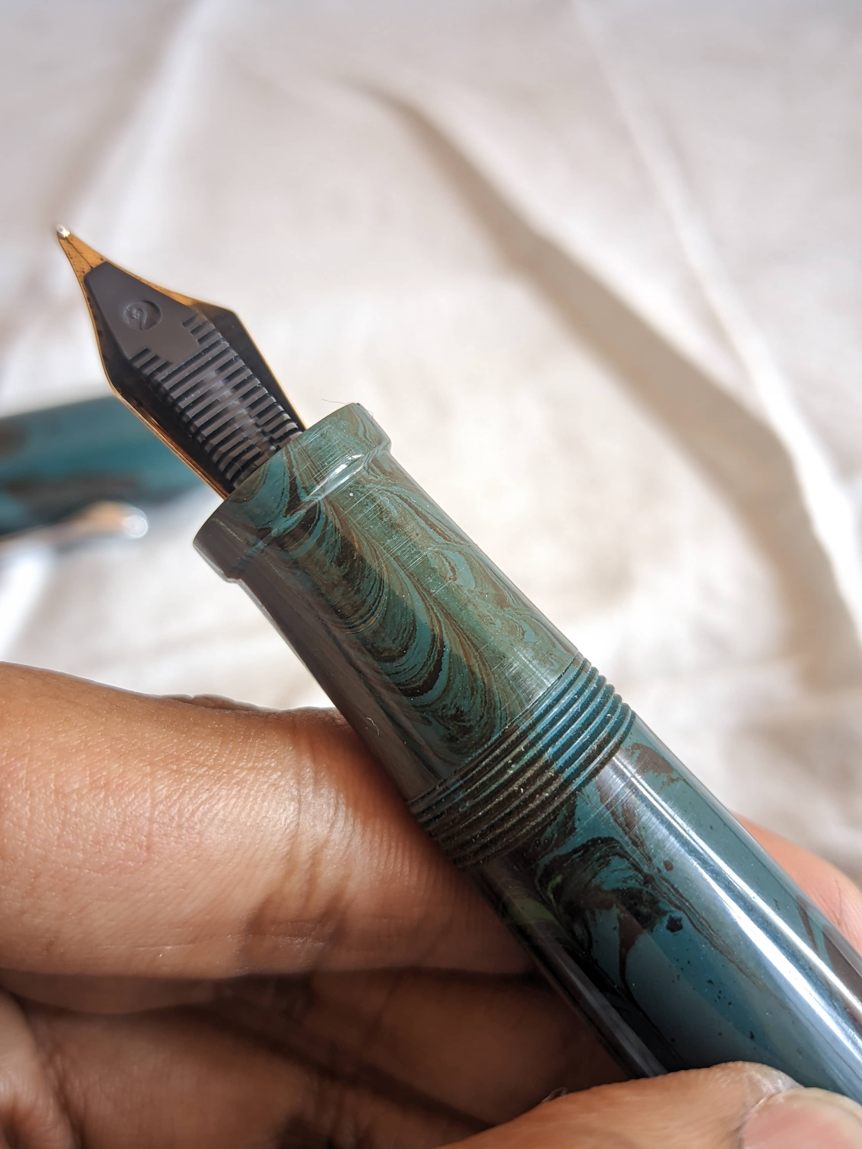
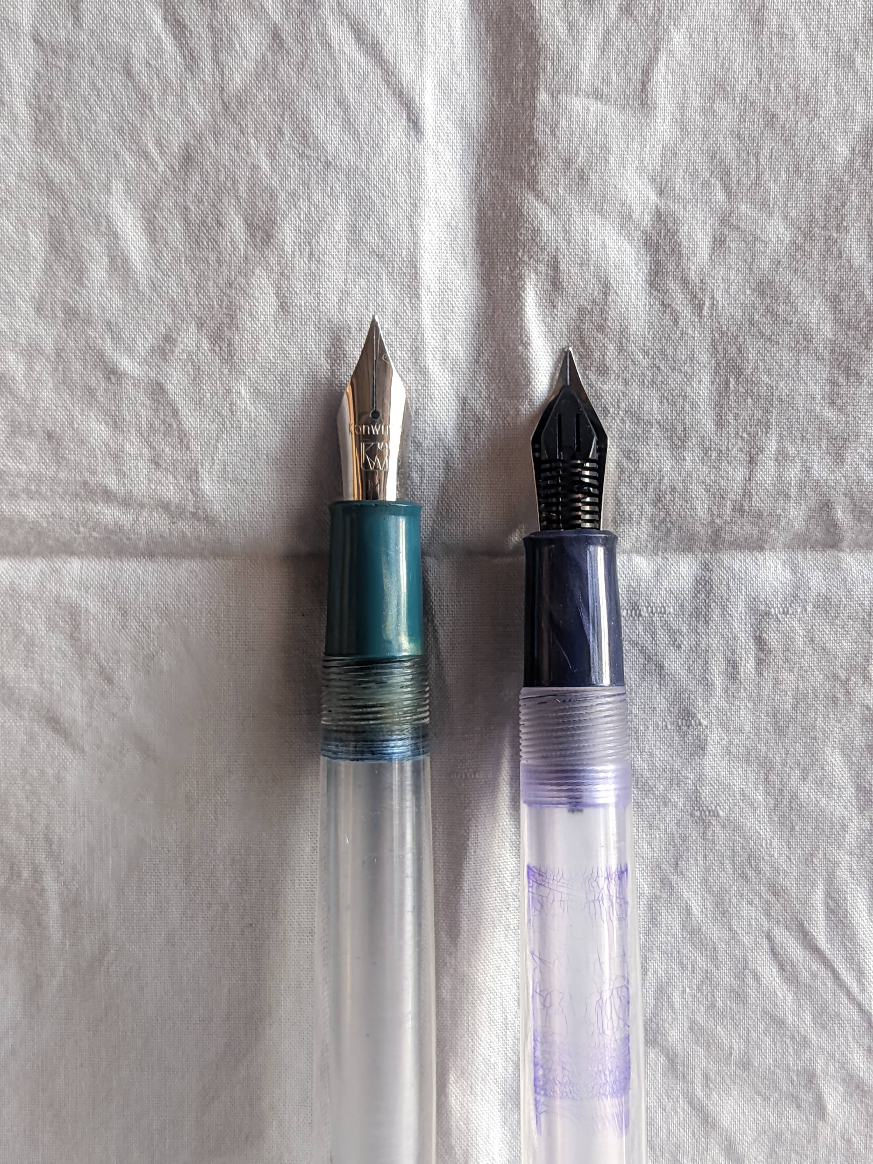
Image Description Image Description At the end of the section, we find the #40 nib unit from ambitious. For the international folks, the #40 nib is kinda... sorta... a #8, but it isn't. It uses the standard 6mm feed often found in #6 nibs, but it is longer and flared out. Kinda like a #6.5 nib. the #40 comes from the length of the nib which is 40mm. The tipping with Ambitious nibs has always been ambiguous, in my experience. this one comes with a fine-medium tipping.

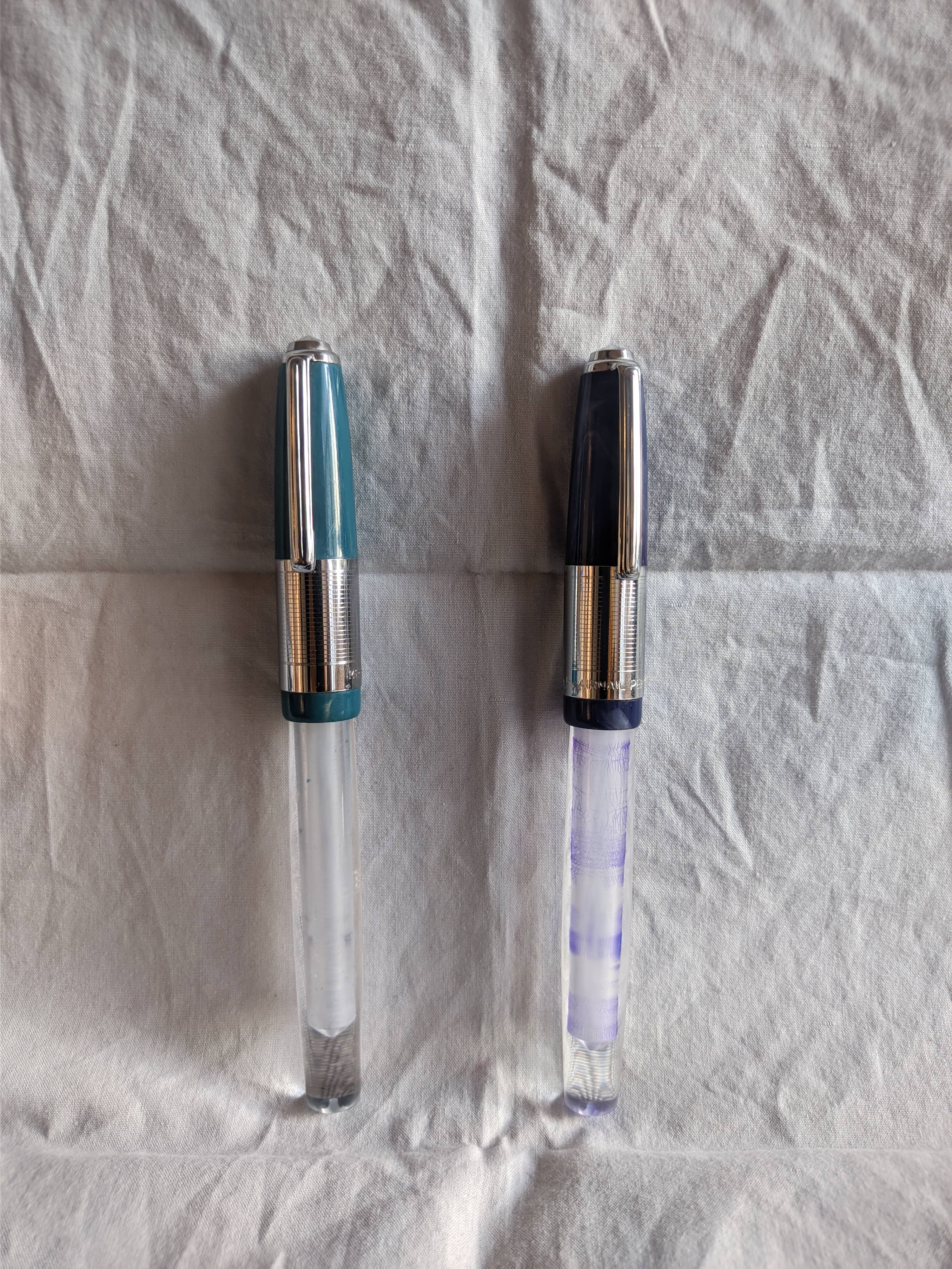
For reference, here it is with my other PLP jumbo, that I bought almost 2 years ago. This is the standard round top with the Jowo nib unit. If you buy from their site, this is the model that you'll get.
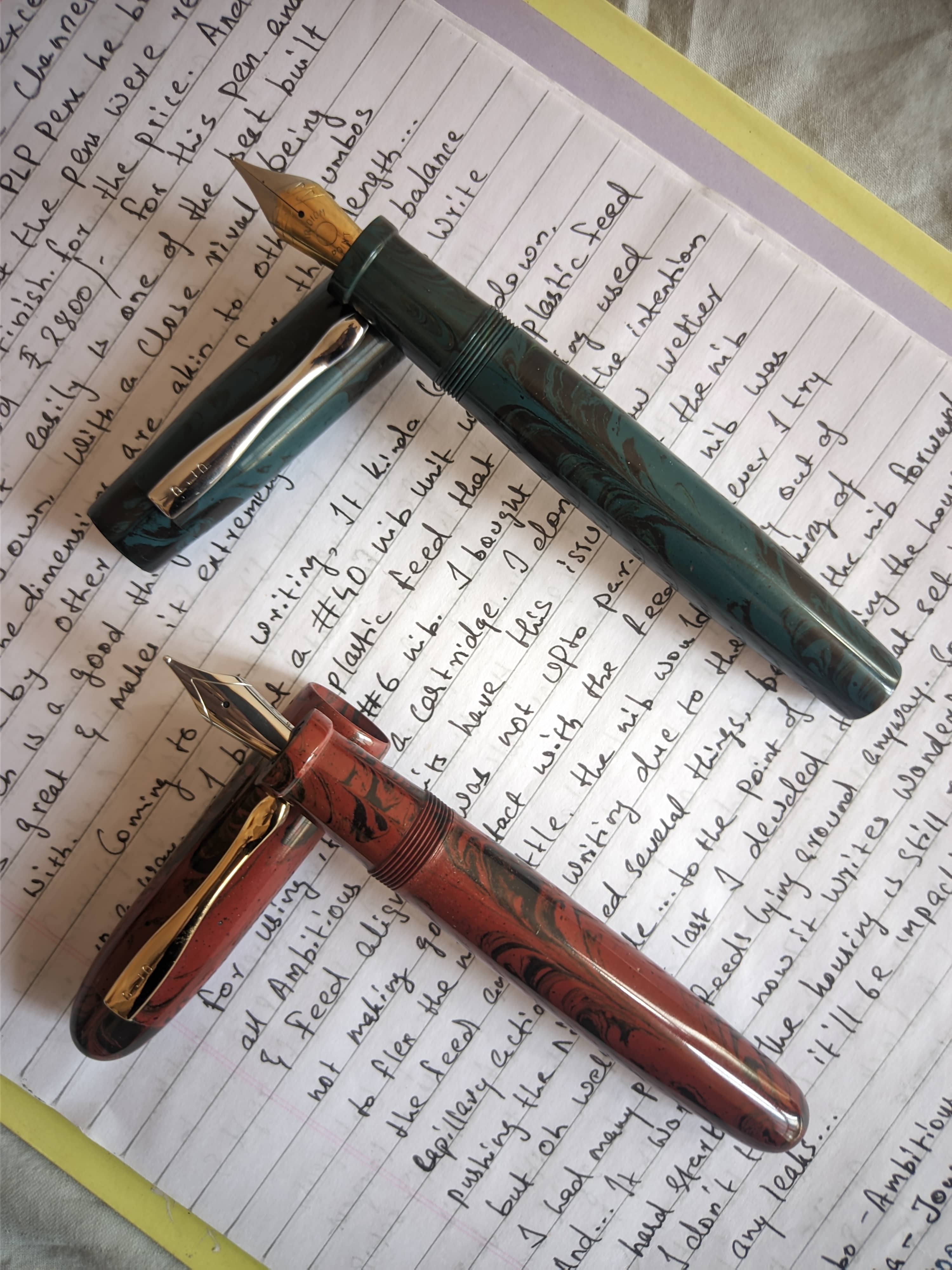
Image Description

As a jumbo pen, it feels manageable. I think it's mostly due to the length. the length feels natural and provides a good balance while writing. the bigger nib also makes you grip the pen a bit further back and have a narrower angle, aiding in the writing experience, especially for my long skinny hand.
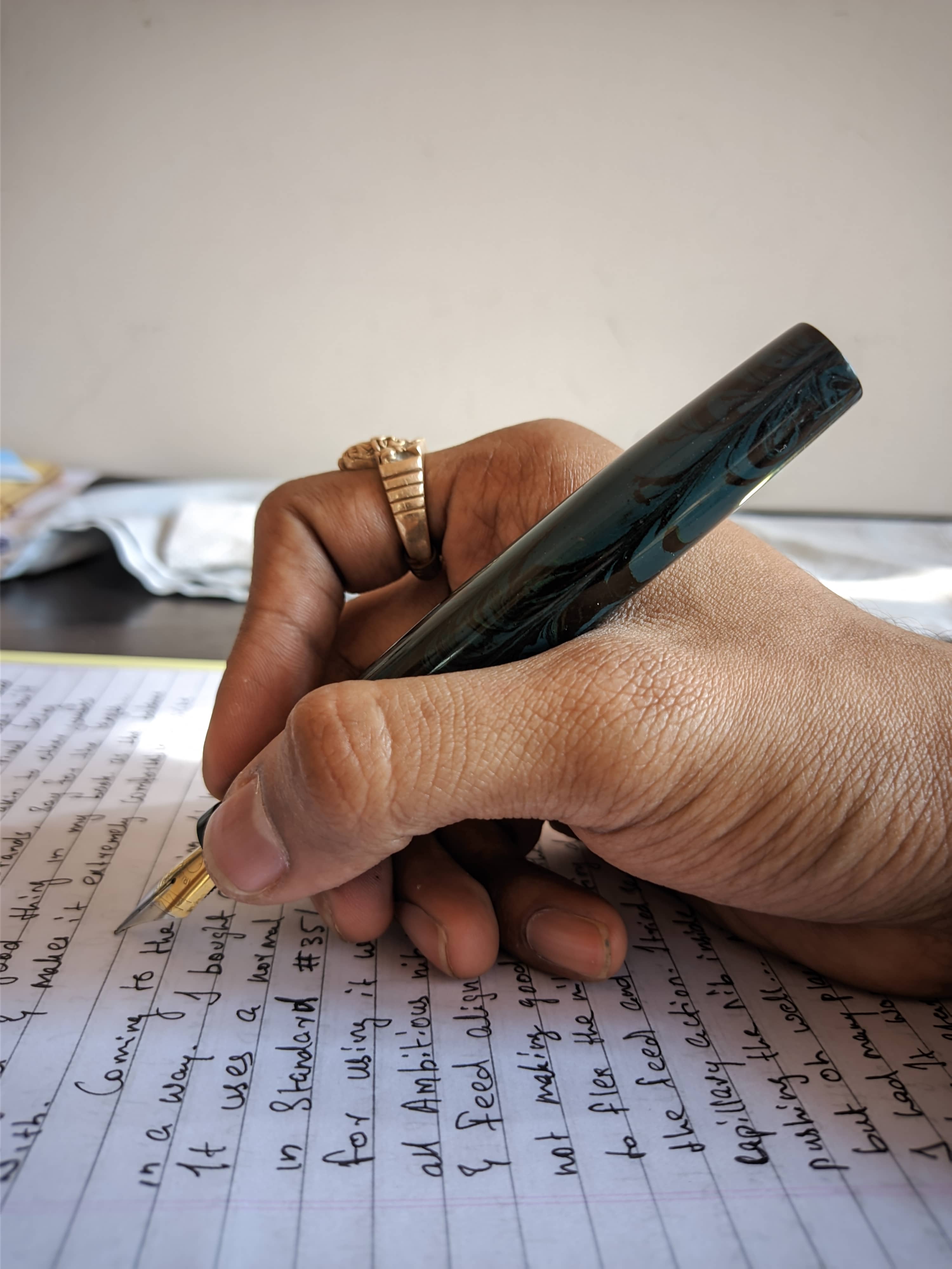
Image Description

As for the raw numbers, here they are... Measurements: - Capped: 150.4mm - Uncapped: 138.5mm - Thickness of the barrel: 17.2 at the thickest and 13.8 at the thinnest - Barrel wall thickness: ~3.0mm - Cap thickness: 19.0mm - Section dimension: 14.9mm tapering to 13.3mm over a length of 18.0mm. After that a flare out to 14.6mm over a length of 3.5mm

Comparing with some other pens, from left to right: - PLP Jumbo Flat Top - PLP Jumbo Round Top - Gama Supreme - Woodex Model #39 - Jinhao 100 Centennial - Asvine V1216 - Kanwrite Desire
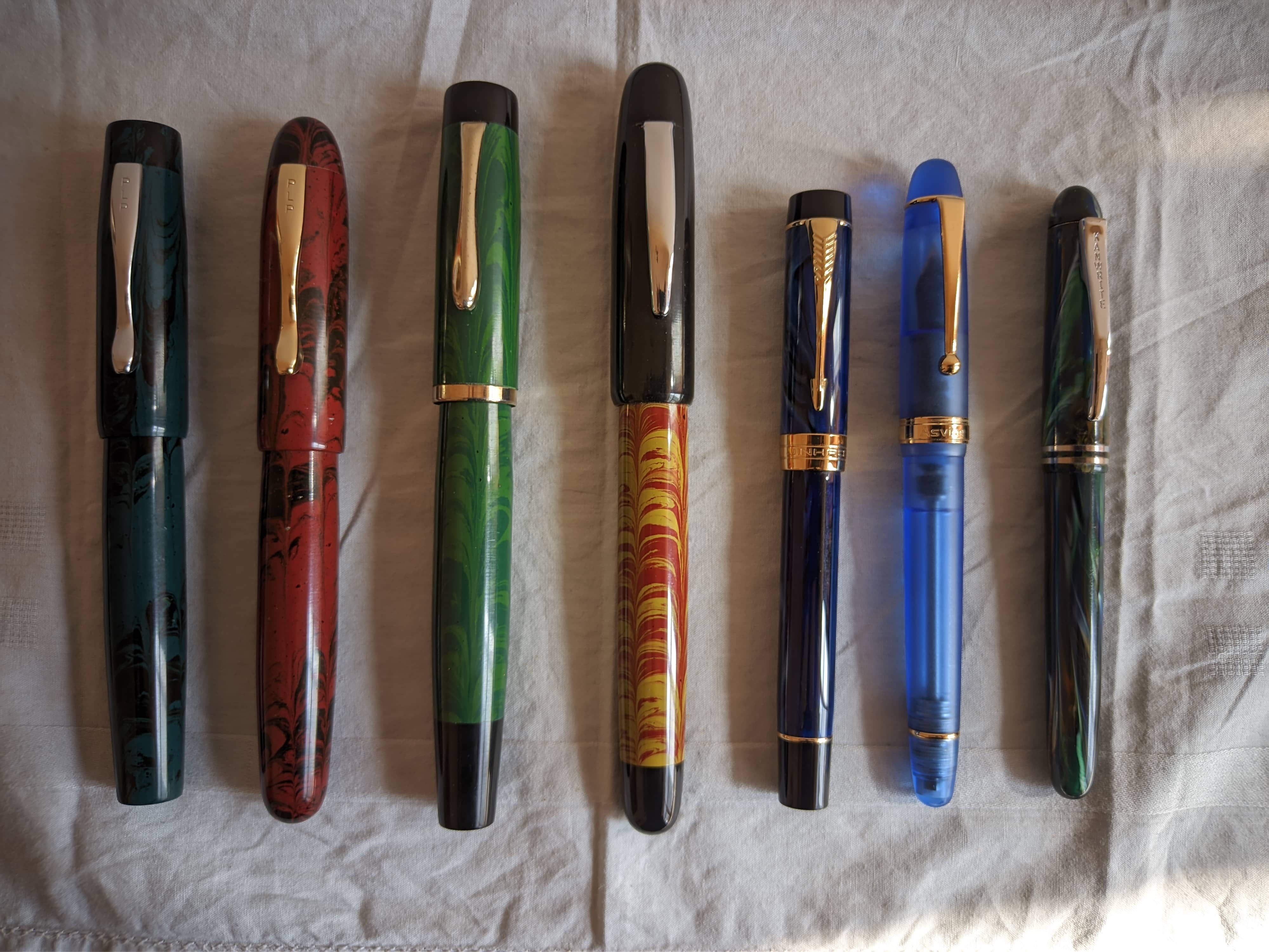
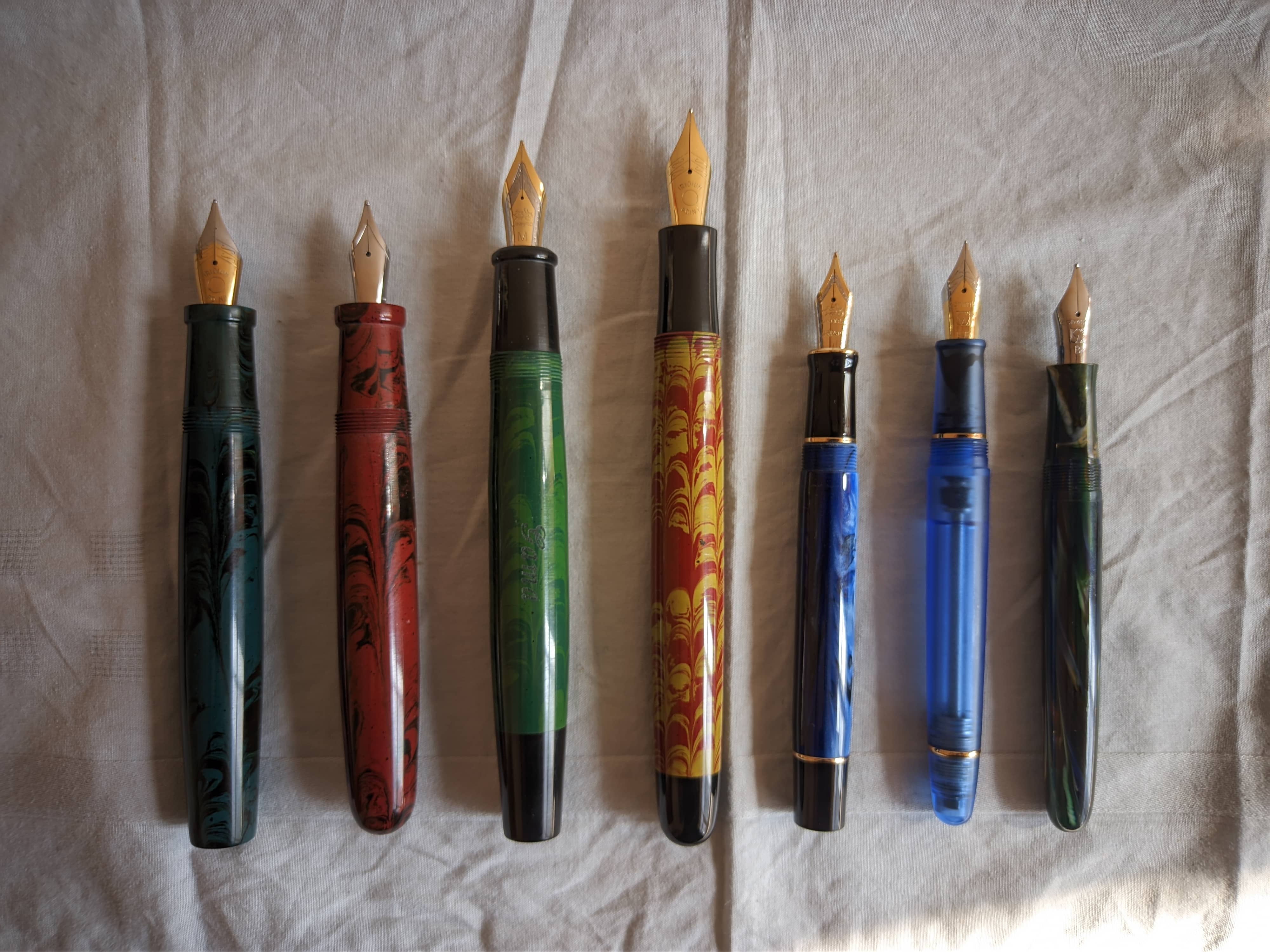
Image Description Image Description

In regards to some other models from PLP itself: - PLP Jumbo Flat Top - PLP Jumbo Round Top - PLP Double Ring - PLP Scenic

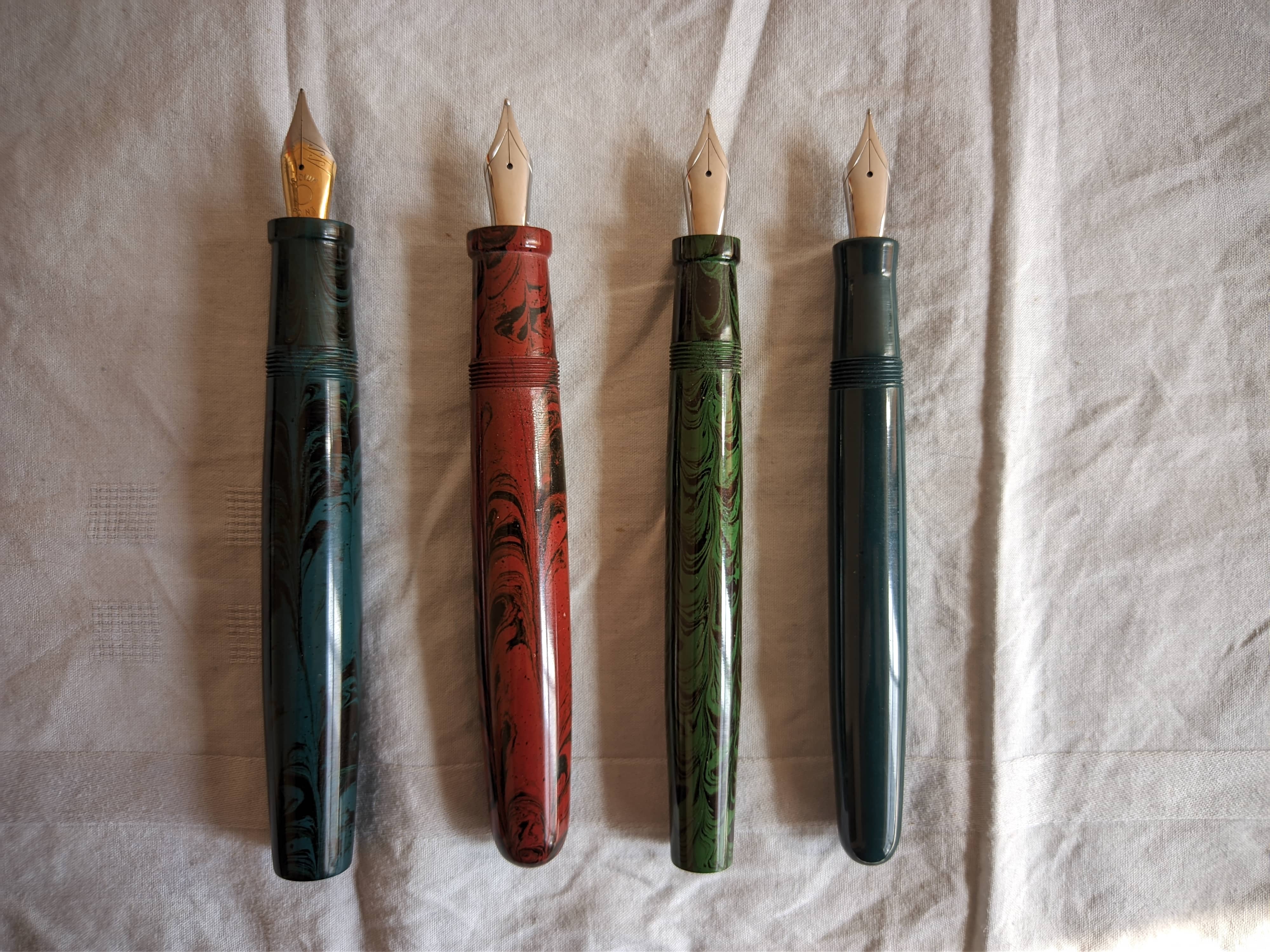
Image Description Image Description

Overall, the design is classic, the build is solid, and the finishing is excellent. For the price, you're getting a hell of a lot of pen.

Nib And Writing

This is a mixed bag for me. After the excellent performance of my previous jumbo, I was really looking forward to this one. I don't know whether it was an issue with my nib unit or it is inherent with all Ambitious #40 nib, but my nib unit was riddled with flow issues. The nib is a large nib, but the metal is fairly thin, giving it some bounce. But when you push the nib ever so slightly, the contact between the nib and feed is separated, and the flow stops due to the break of capillary action. I bought the nib unit primarily to have the finned plastic feeder, for reducing chances of burping while I am using it as an eyedropper. At first, I used a generic black cartridge, to test the #40 nib, but after some tinkering which included: - Widening the tine gap - Pressing the nib deeper into the housing... so much so that I think I cracked the housing. Didn't cause any leakage though...

But alas... All these never solved the issue for me, I then filled the barrel with pilot black. Still no hope... As a last resort, I tried to heat set the feed. You heard it right!!! Heat setting a plastic feed... I have some spare feeds from some kanwrite nib units, so I wasn't too worried, but this was the first time I was doing it. I heated a cup of water till it was boiling hot, and I suspended the feed onto the water using a clip. I kept it there for about a minute and a half, and gently bowed the feed upwards. I could feel the feed flexing, and held it there for around half a minute.... I could see the end of the feed bowing upwards ever so slightly... I did it a couple more times and inserted the nib and feed into the housing... And voila!!! It worked!!! The pen wrote with a moderate flow, a bit on the drier side but laying down an ample amount of ink. (That's why you'll notice a change in line boldness around the halfway mark on the first page of the writing sample). Since ambitious has always been ambiguous on their nib sizes, I had no expectation on what tipping to expect. The nib I got had a tipping between fine and medium, more closer to the fine side. Like an Indian medium. The nib was a bit scratchy, due to the misalignment of the tines. Though, that must have been my doing trying to get the flow right on the thing. But after a quick adjustment... again... it writes nicely.
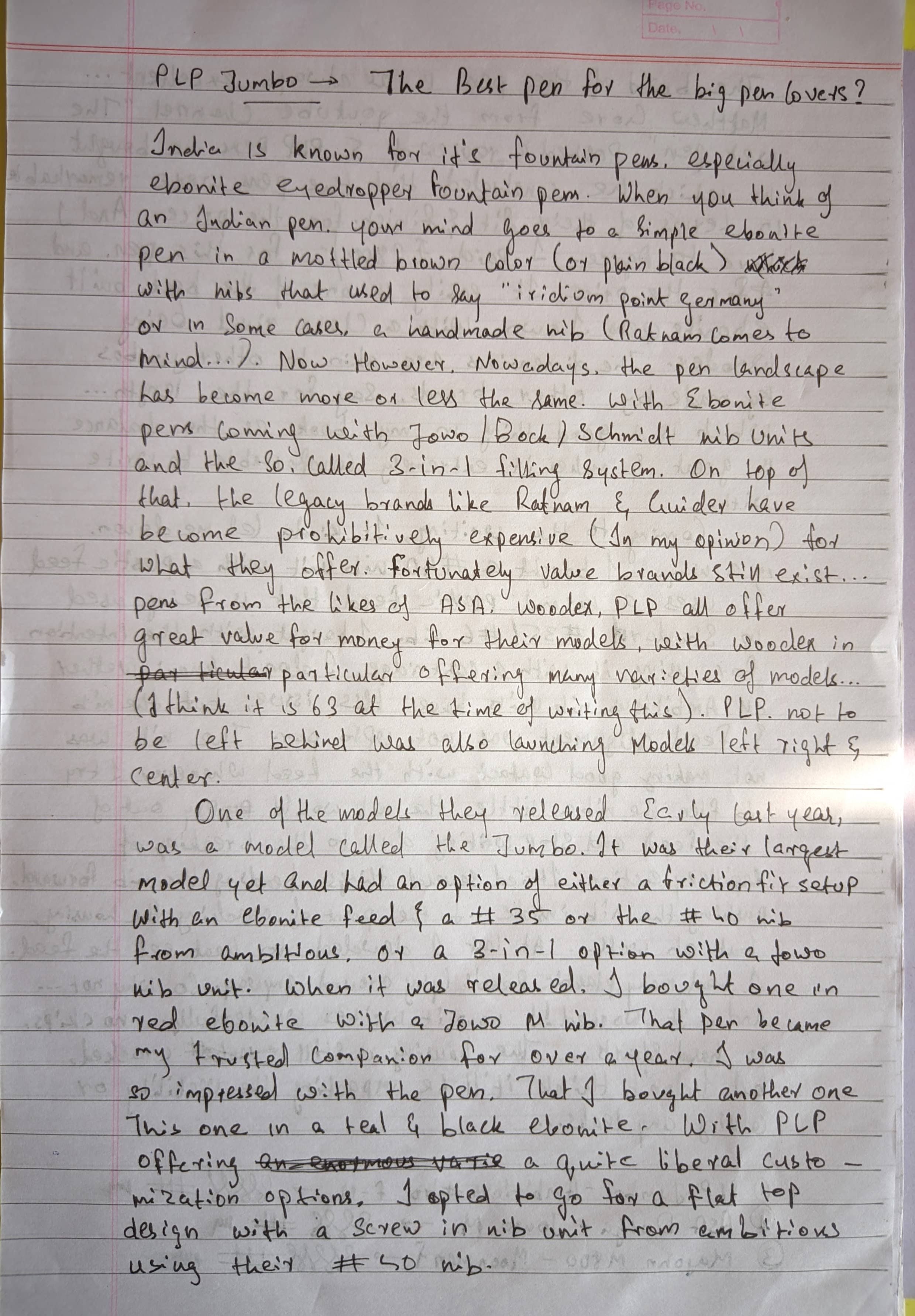
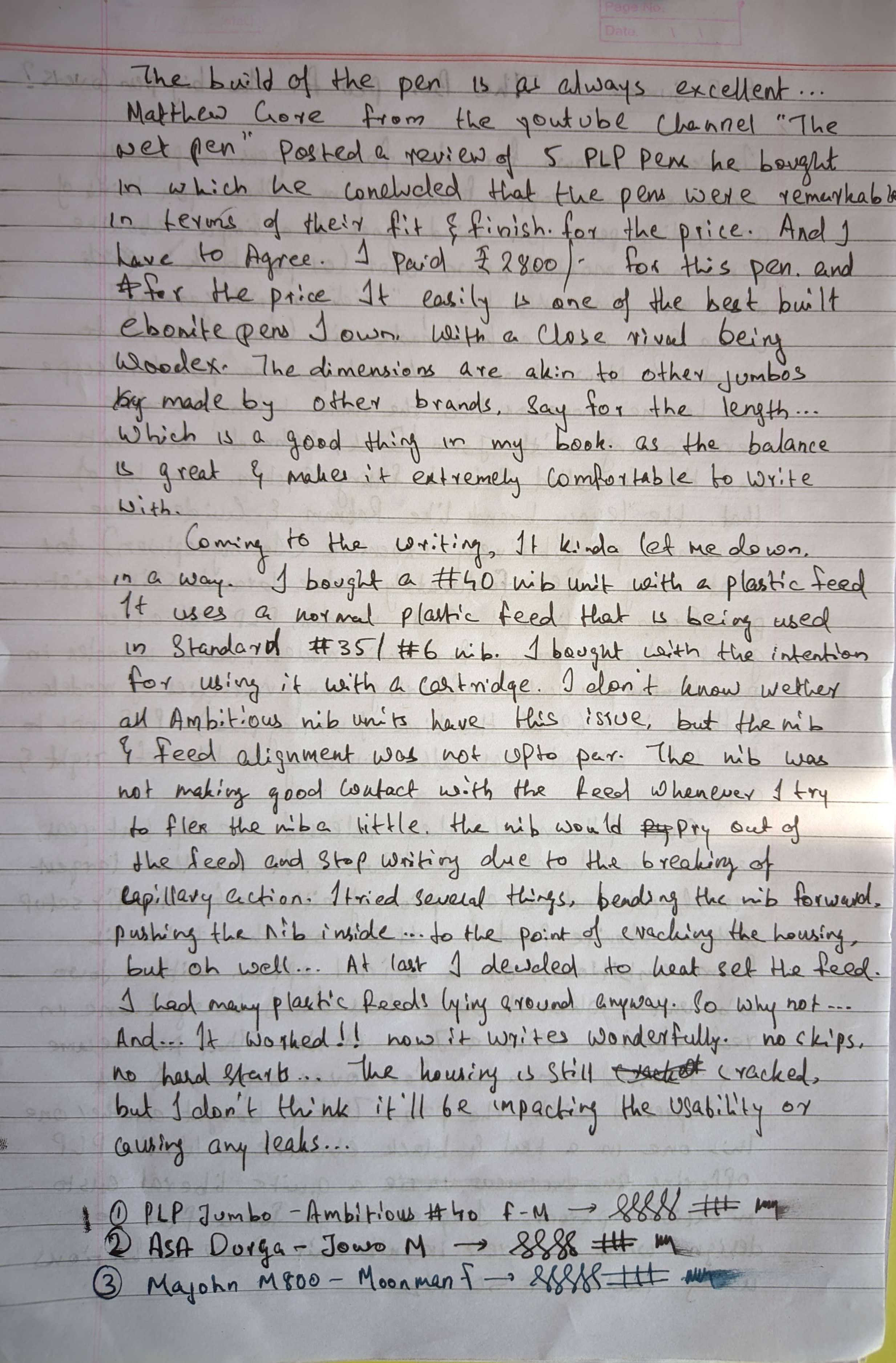
Image Description Image Description

For those going to purchase the pen, do yourself a favor and avoid the #40 nib unit. Just buy the #40 nib friction fit on an ebonite feed. You will be limited to using it as an eyedropper, but it'll be much more reliable. Plus the barrel wall is thick enough that I don't think the pen will burp all that much... If you're cautious, you can always ask Satish sir to make the barrel walls thicker, reducing the ink capacity, but offering better insulation. Image Description
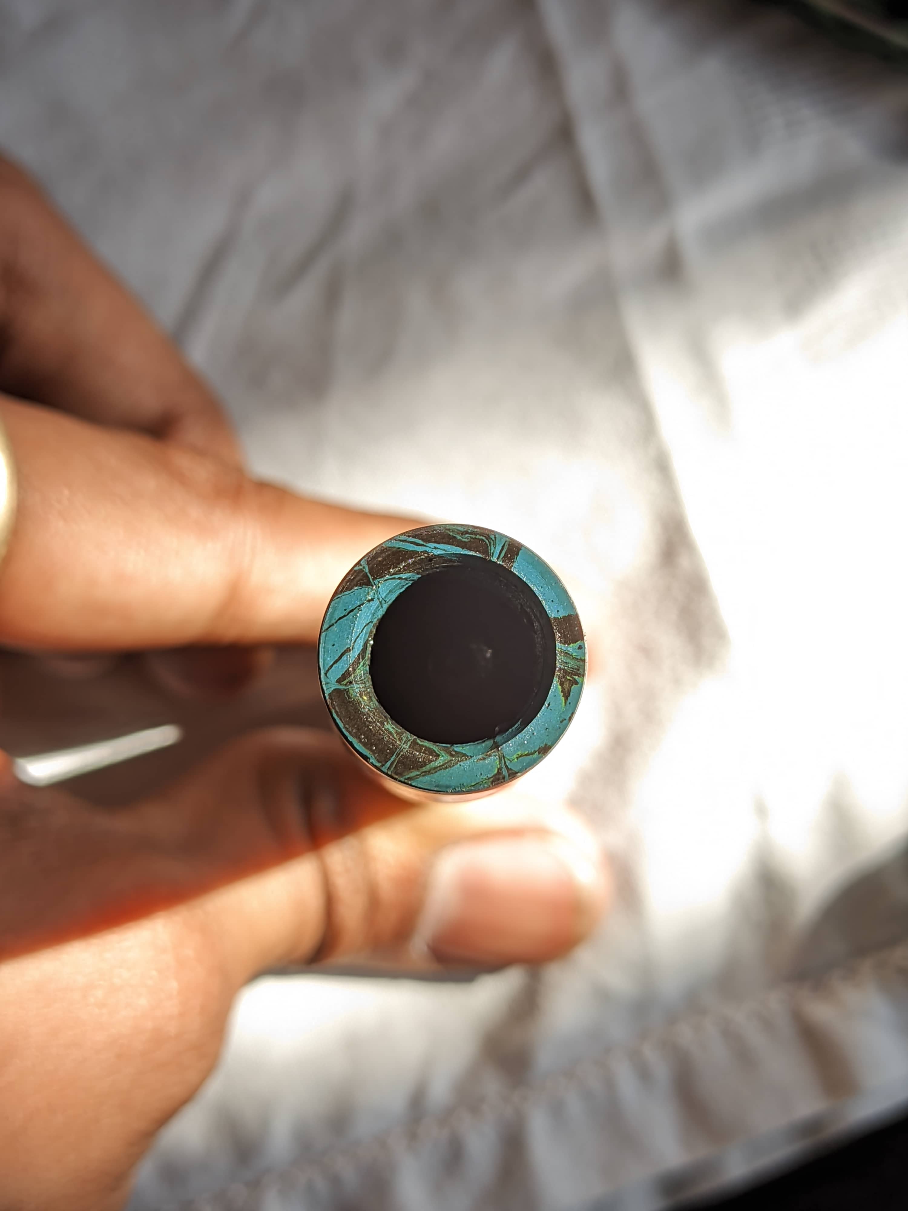
If you do want to use cartridges and converters, go with a Jowo nib unit instead. Again, it'll be a much more reliable pen.

Final Verdict

I paid ₹2800/- for this pen as specced. And for the price, you are getting a whole lot of pen. But as I said before go with anything other than the #40 nib unit. My experience has been not so stellar. But after these tweaks, it is now one of my favorite pens and one of my go-to everyday carries. So spec yours wisely and you have a great pen in hand.
Claude 3.7 Sonnet... Is This the AI Model That Will Redefine Coding?

The tech world is buzzing with anticipation, and for good reason. Anthropic has just dropped Claude 3.7 Sonnet, and it's not just a minor update – it's a seismic shift in the landscape of language models, particularly for developers. Forget incremental improvements; Claude 3.7 Sonnet is being hailed as a major leap forward, overshadowing its predecessors and even posing a serious challenge to models from industry giants like OpenAI. But is it all hype, or does Claude 3.7 Sonnet truly live up to the bold claims, especially when it comes to coding and beyond? Let's dive into the details.

Coding Prowess: Setting a New Gold Standard

If you're a programmer, Claude 3.7 Sonnet is designed to get your attention. Early assessments position it as a top-tier coding model, potentially the best in the game right now. This isn't just about handling simple scripts; we're talking about excelling in complex coding tasks and real-world programming scenarios. Anthropic emphasizes that Sonnet is now faster and more intelligent than previous versions, maintaining top-tier performance while significantly increasing speed.

Benchmark results are backing up the buzz:

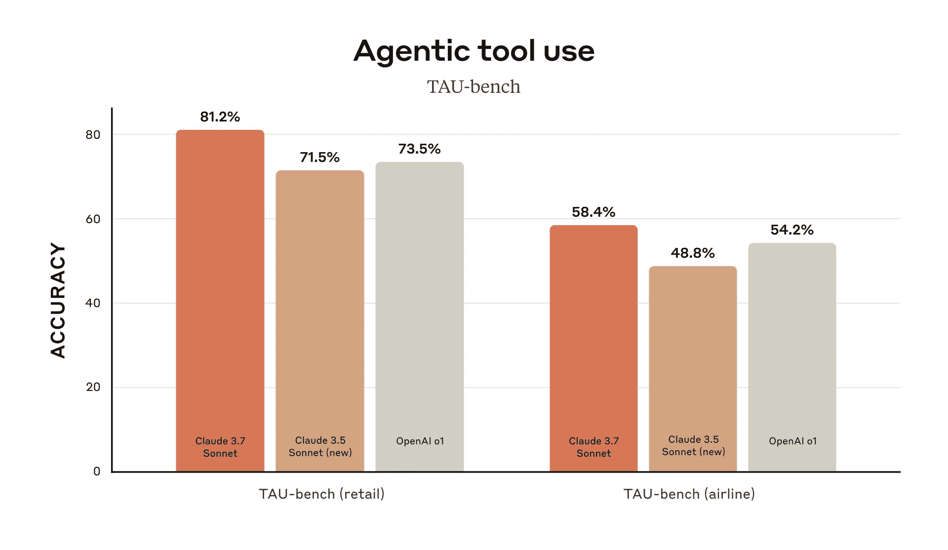
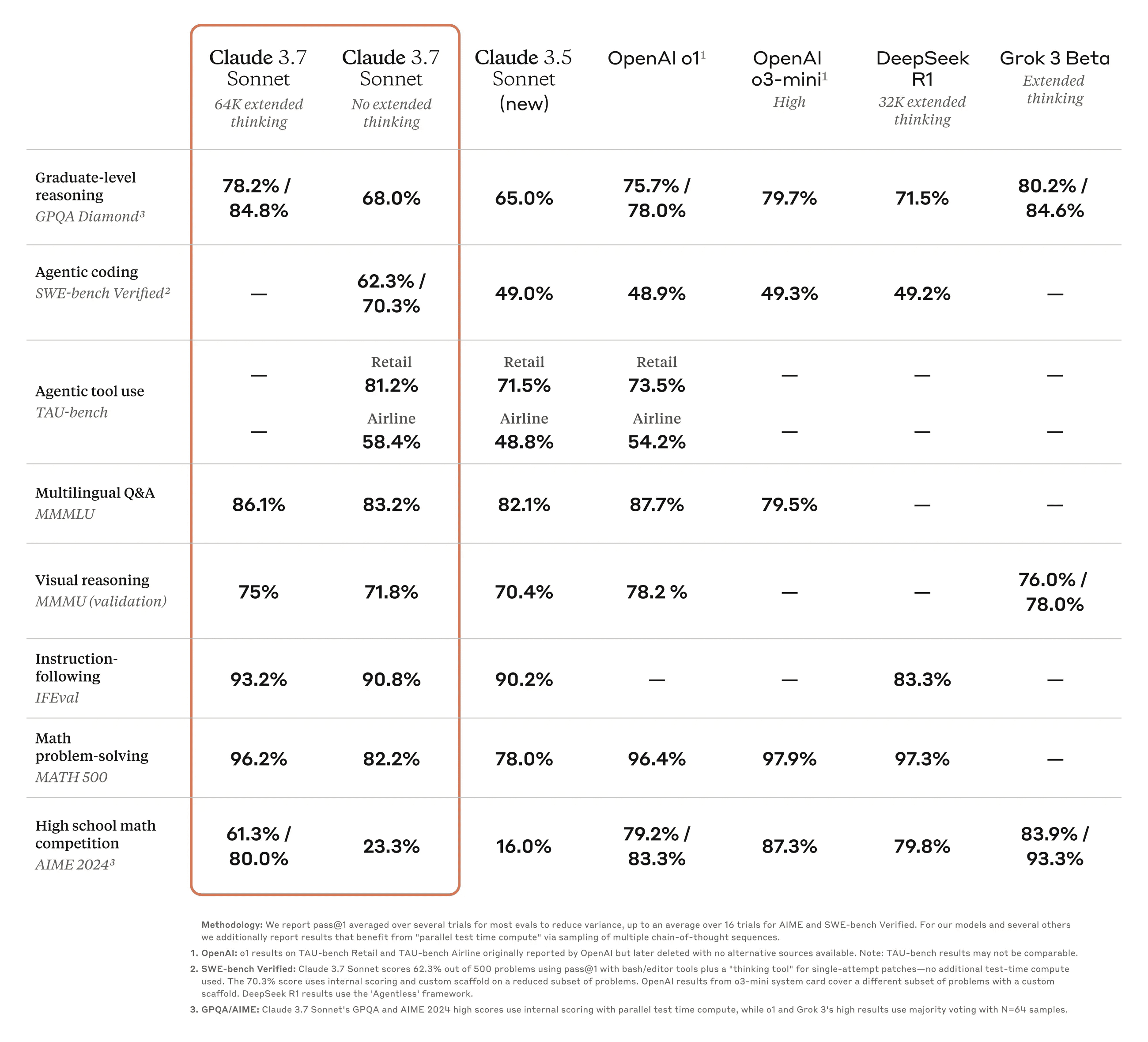
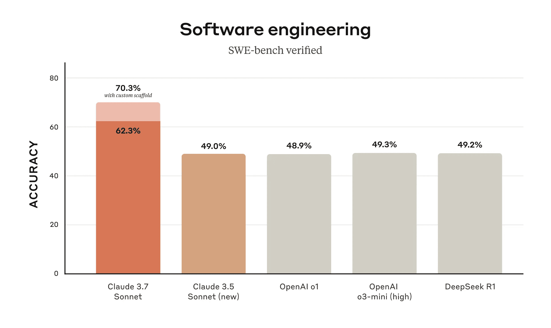
  • Benchmark Dominance: Claude 3.7 Sonnet isn't just inching ahead; it's outperforming previous models, including OpenAI's, in rigorous benchmarks like SWE-Lancer. This benchmark is crucial as it reflects effectiveness in tackling diverse, real-world programming challenges. Image Description
  • HumanEval Success: Achieving a 70.3% success rate on the HumanEval benchmark is no small feat. This signifies a substantial improvement in its ability to solve complex coding problems. Image Description
  • Tool Mastery: Claude 3.7 Sonnet isn't just a code generator; it's a master of tools. Its proficiency in utilizing instructions for specific actions, like API interactions, makes it exceptionally well-suited for intricate, agentic workflows.
  • Instruction Following and Multilingualism: It continues to lead the pack in instruction following, ensuring it understands and executes your commands with precision. Furthermore, its strong multilingual question-answering capabilities broaden its appeal to a global developer audience. Anthropic highlights its improved understanding of nuanced instructions, especially in complex, multi-turn conversations.
  • Reasoning Fundamentals: It shows solid performance in basic reasoning and word manipulation tasks, essential for understanding and processing complex code logic.

Image Description However, it's not all perfect code and flawless logic. Claude 3.7 Sonnet does show some limitations:
  • Complex Reasoning Hurdles: When faced with truly complex reasoning puzzles, like a convoluted hourglass challenge, it can falter, even in its "thinking mode."
  • Math Problem Weakness: Interestingly, it underperforms in math problem-solving compared to some earlier models. This suggests a specialization towards coding and language-based tasks rather than numerical reasoning.
  • Chess Engine Hiccup: In a demanding test – coding a chess engine – Claude 3.7 Sonnet could generate a large volume of code and even fix compilation errors. However, the engine ultimately failed to make legal chess moves, revealing potential weaknesses in generating logically sound programs for complex games.
  • Front-end UI Excellence: On the brighter side, it shines when generating front-end user interfaces. It's shown to surpass models like OpenAI's 03 Mini High in both code quality and the actual functionality of the UI it creates.

Beyond Coding: Expanded Capabilities

Claude 3.7 Sonnet isn't solely focused on code. Anthropic emphasizes its enhanced capabilities across a broader spectrum:

  • Visual Capabilities: The model boasts stronger vision capabilities, adeptly handling a wide range of visual formats including graphs, charts, and images. This makes it more versatile for tasks involving visual data analysis.
  • Agentic Workflows: It is designed for complex agentic workflows, excelling in tool use and multi-step reasoning, making it suitable for sophisticated AI applications.
  • Customer Support and Sales: Anthropic specifically points out its suitability for customer-facing roles, including customer support and sales, due to its improved conversational abilities and nuanced instruction following.
  • Knowledge Retrieval: Claude 3.7 Sonnet is also highlighted for its improved knowledge retrieval from extensive datasets, making it a valuable asset for research and information-intensive tasks.

Meet Claude Code CLI: Your New Command Line Companion

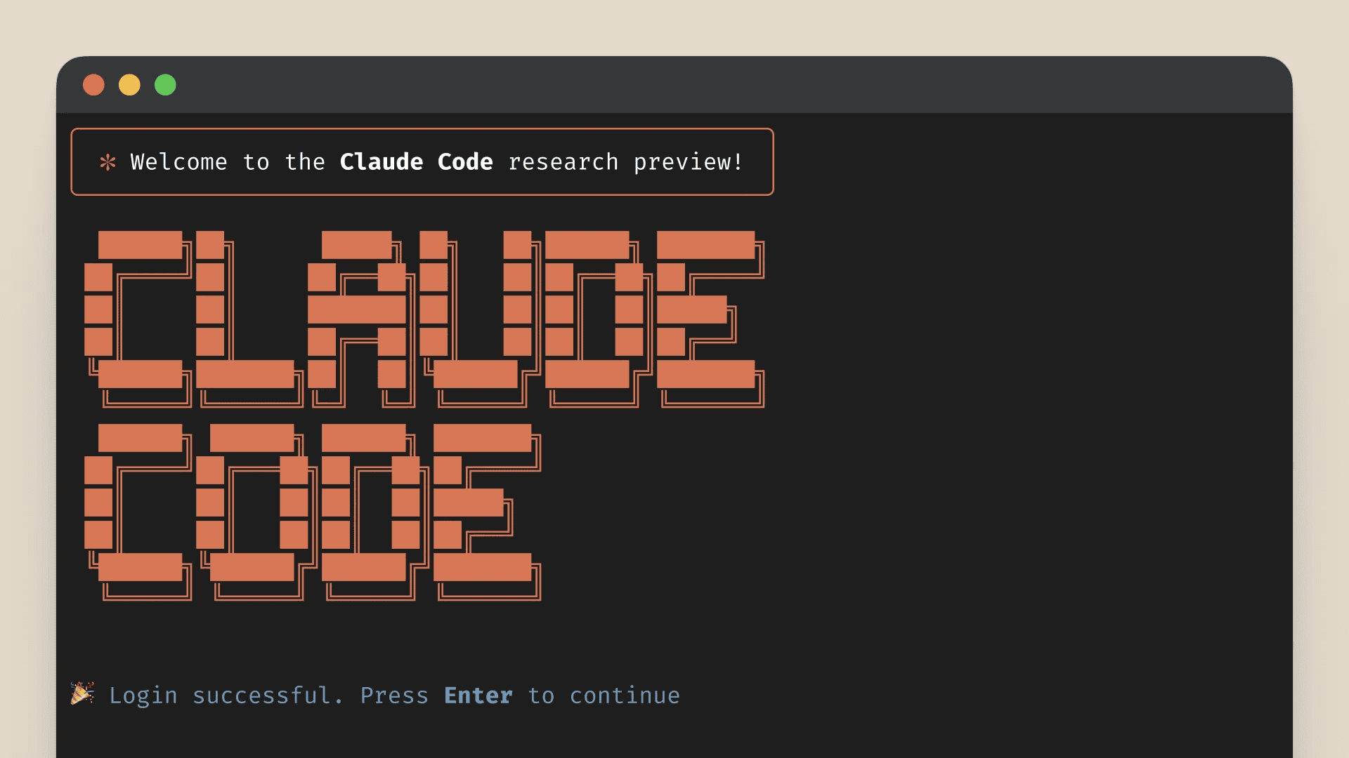
Anthropic isn't just releasing a model; they're building an ecosystem around it. Enter Claude Code, a brand new Command Line Interface (CLI) designed specifically for developers. This tool is a game-changer for how programmers interact with codebases:

Image Description

  • Streamlined Workflow: Claude Code is all about simplifying development. It allows you to directly interact with your code projects through Claude, promising a more intuitive and efficient workflow.
  • Key Functionalities:
    • Project Scanning (init command): Quickly analyzes and understands the structure of your projects.
    • Cost Tracking (cost command): Keeps an eye on your Anthropic API usage costs, essential for budget-conscious developers.
    • Test-Driven Code Generation: Facilitates building robust code with a focus on testing from the outset.
  • Challenging Existing Tools: Claude Code is stepping into the arena of IDE extensions like Cursor, offering a fresh approach to code refactoring and project management directly from the command line.
  • Easy Installation: Get started quickly with installation via npm.
  • Cost Awareness: It's important to remember that Claude Code utilizes the Anthropic API, which, while powerful, can be on the pricier side.

Unveiling the "Thinking Mode": A Glimpse into AI Reasoning

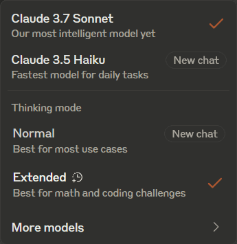
Claude 3.7 Sonnet is being touted as the first hybrid reasoning model, offering a unique "thinking mode" that provides unprecedented transparency into its cognitive process.

Image Description

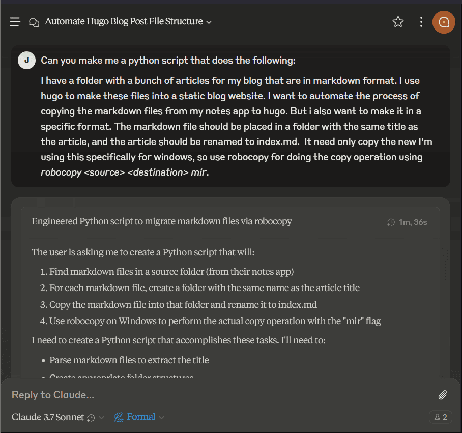
  • Transparent Reasoning: The "thinking mode" allows users to actually observe Claude 3.7 Sonnet's reasoning steps as it tackles a problem. This level of insight is groundbreaking and could be invaluable for understanding how AI models arrive at their conclusions.
  • Thinking Mode Nuances: Interestingly, early tests suggest that in very complex puzzles, the "thinking mode" might not always lead to the most optimal solution compared to the standard model. This hints at the complexity of AI reasoning and the potential for different approaches to be more effective in different situations. Image Description

Cost and Access: Premium Power at a Price

While Claude 3.7 Sonnet offers impressive capabilities, it's essential to consider the cost:

  • Priced Similarly to Claude 3.5: The model is priced similarly to its predecessor, Claude 3.5. Which is:

In both standard and extended thinking modes, Claude 3.7 Sonnet has the same price as its predecessors: $3 per million input tokens and $15 per million output tokens—which includes thinking tokens.

-Anthropic

  • More Expensive than Budget Options: It's significantly more expensive than more accessible models like 03 Mini.
  • Affordable Alternatives: Services like T3 Chat might offer more budget-friendly ways to access Claude 3.7 Sonnet's power.

Imperfections and the Path Forward

Claude 3.7 Sonnet is undeniably powerful, but it's not without its limitations:

  • Occasional Errors: Like all AI models, it's prone to errors, highlighting the ongoing need for careful code review and testing.
  • Technology Integration Gaps: It may sometimes struggle to seamlessly incorporate specific technologies requested in prompts, such as TypeScript or Tailwind CSS.
  • Complex Code Challenges: Generating error-free code for highly complex applications, like an encrypted app, can still be a hurdle.

The Verdict: A Powerful Tool with Evolving Capabilities

Claude 3.7 Sonnet is a significant advancement in the world of AI language models, marking a notable step up in both speed and intelligence compared to previous models. Its exceptional coding capabilities, innovative CLI tool, broader skill set including enhanced vision and knowledge retrieval, and transparent "thinking mode" make it a compelling option for developers and businesses seeking cutting-edge AI assistance across various applications. While it's not without its imperfections and comes at a premium price, Claude 3.7 Sonnet represents a major step forward and signals an exciting trajectory for the future of AI in software development and beyond. It's a model to watch closely as it continues to evolve and potentially reshape how we work and interact with AI.


Sources:

Click Retro Review

A Worthy Successor to Airmail?

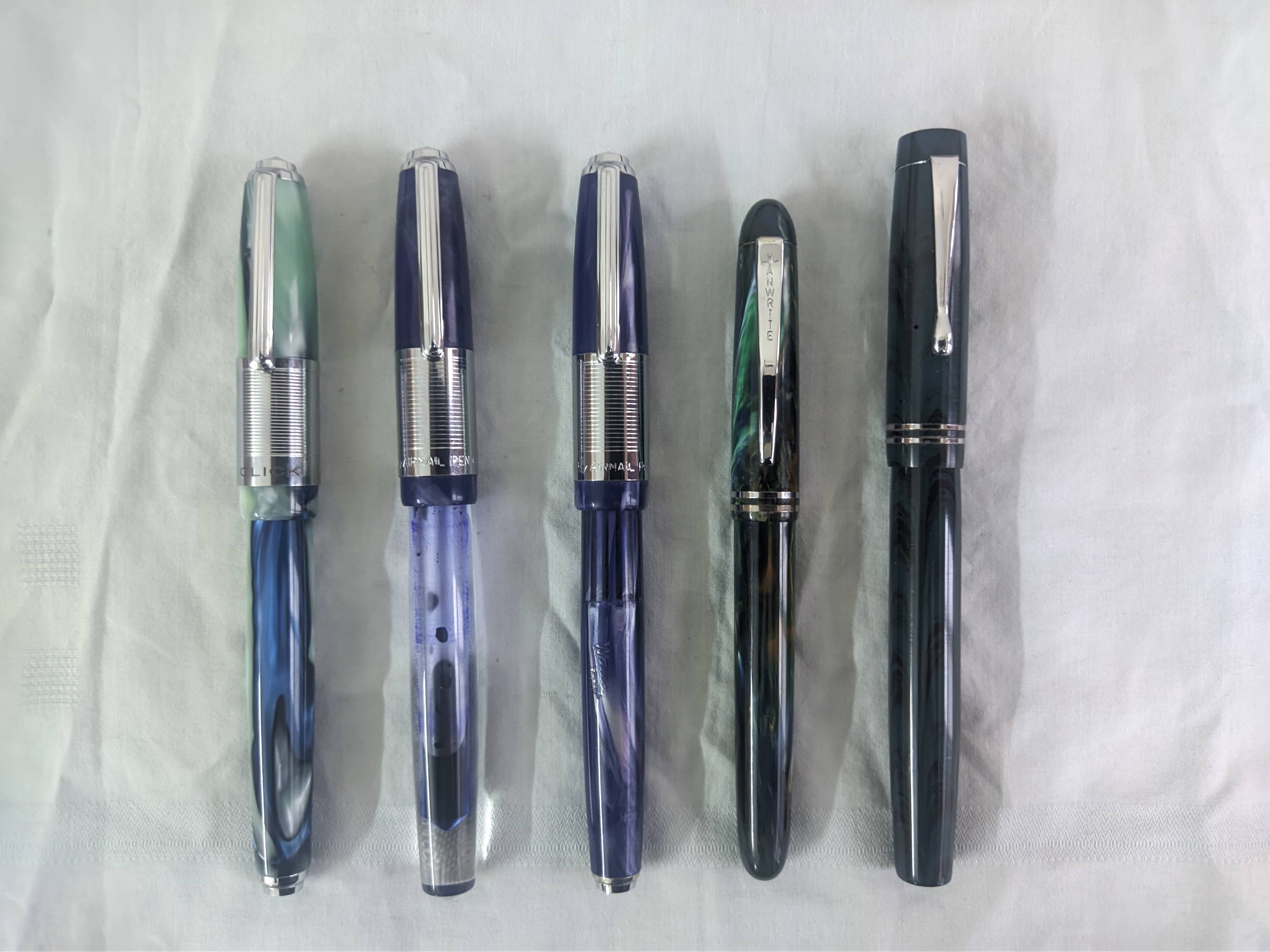
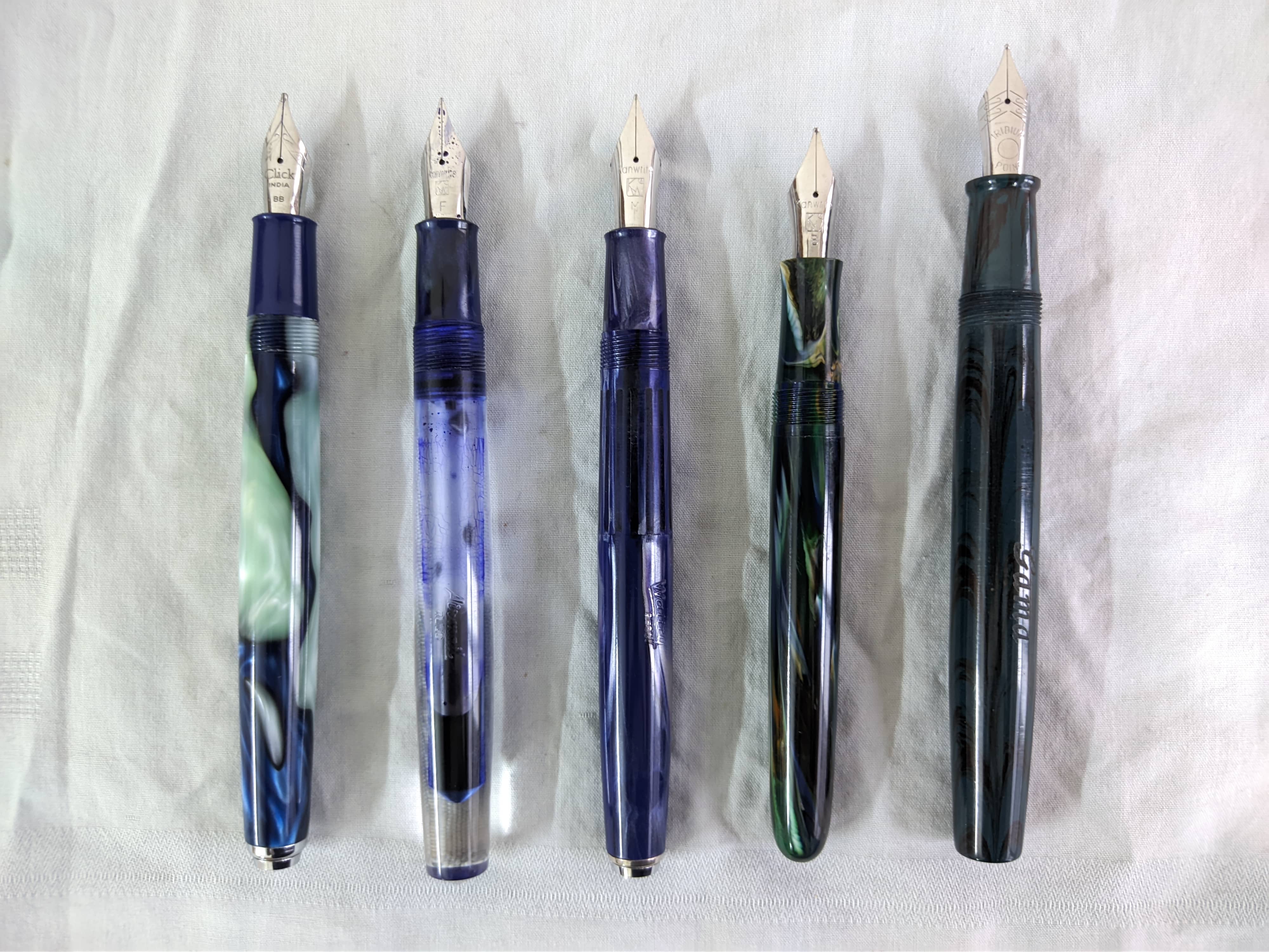
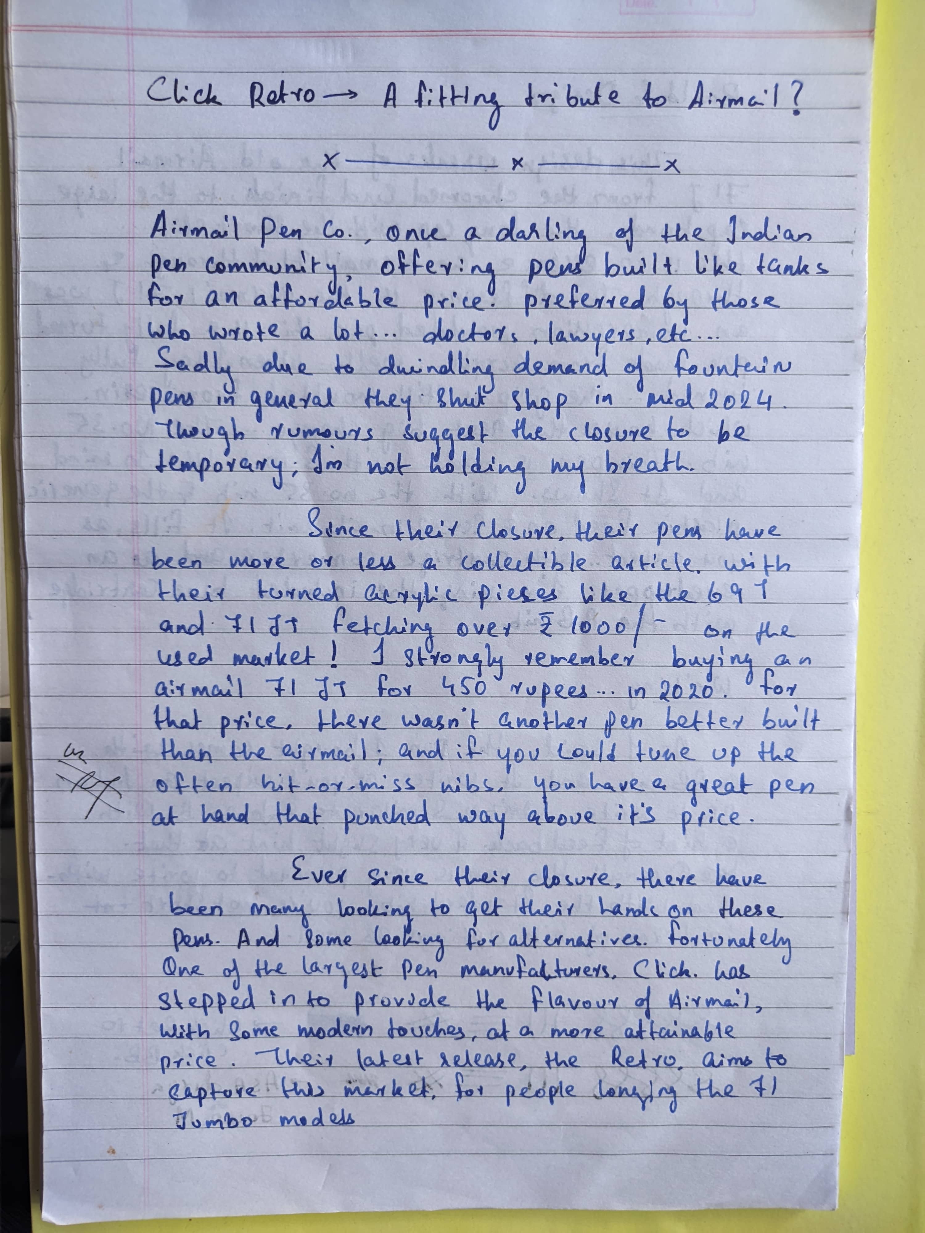
If you.ve been in the Indian fountain pen scene for any number of times, you might have heard of 'Airmail' and/or 'Wality'. This was a pen brand based out of Mumbai, with Airmail being the Indian brand, and Wality being the export focused brand. This was a well received brand among pen enthusiasts, mostly for providing solidly built workhorse pens for an affordable price. The pens were usually eyedropper pens, with some piston fillers here and there, and they usually came with their in-house nibs. Two of their most famous models were the 69 series and the 71 series, with the 69T(L) and the 71JT being the brand's most iconic models. These eyedropper-only pens used to be made out of clear acrylic for the barrel and compression moulded plastic (usually the same CAB resin used in other Indian pens) for the section and cap. The pens came with an airmail branded #8 nib(in international nib sizing terms, it'll be more like a stubby #6 nib, more akin to the size of Sheaffer nibs you'd find in pens like the No-nonsense, School pen, Award series, etc.) over a basic ebonite feed. These pens were very popular among the community, not only because of the great build quality, but also the customization potential. since the feed was a standard 6.3mm feed, same as you'd find in a typical #6 nib, there were plenty of people often modding their pens with the aformentioned #6 nibs, mostly from Kanwrite, to some basically threaading the section to fit a nib unit from JoWo or Bock. Another hack was swapping the feed to a Sheaffer feed used in the No-Nonsense pen. This eliminated the main problem of eyedropper pens, which was the burping of ink after the ink level gets below around ⅓rd. I personally have 2 71JTs and a 69T, all of which I've modded with Kanwrite nibs and Sheaffer feeds, and they're incredible workhorse pens for the price. Here's a picture of my 2 79JTs with the said modifications, I left the 69T at my hometown at the time of writing this so couldn't get it:

Image Description

Image Description

Sadly, in early to mid 2024, airmail finally closed it's doors. Due to dwindling sales and overall lack of demand for fountain pens in general. One last ditch effort to remain in business, was to make some of their models use a cartridge/converter filler (or 3-in-1 fillers as it was marketed). But it didn't make as big a splash as they hoped such that they could stay afloat. After the closure, as usual with any discontinued product that is popular, the pens have shot up in value. I remember buying the teal 71JT in 2021 for around ₹450/- from Subbu sir of ASA pens, to now, fairly used ones are going out for approx. ₹1200-1300/- and mint ones going for ₹1500-1800. I'm sorry, but for that price, there are far better options in the market. The FOMO surrounding them is the cause of the high demand. For months I've been thinking, we do have so many airmail inspired pens from the market from the likes of brands like Oliver, Artex, etc. (All made by Click pens, I believe), why not make a pen from acrylic like the 71JT, and put a nib unit instead of a friction fit setup to make possible a 3-in-1 setup, and with the improved feed also make the pen resistant to burping.

Thankfully, the ever opportunistic Click, sensed the opportunity, and have (mostly) solved the gap in their latest release, the Retro. I'll get to why I say mostly in the forthcoming section. So let's get on with my opinion on the pen.

TL;DR

If you're looking for a pen with the airmail look, good build quality, a good #6 nib, and the ability to use it as a cartridge converter pen, this pen is a good option for the price on offer which is ₹900. It's definitely cheaper than the airmails that floating around the market. So if you just want the feel of the pen, and care not for the brand, this pen is a great choice.

Design and Build

As I mentioned before, this pen is based on previous airmail pens, as such it shares all of it's characteristics. The long tapered cap, the wiiiiide cap band, the short yet comfortable section, and identical end finials. Lets get through them one-by-one.

Image Description

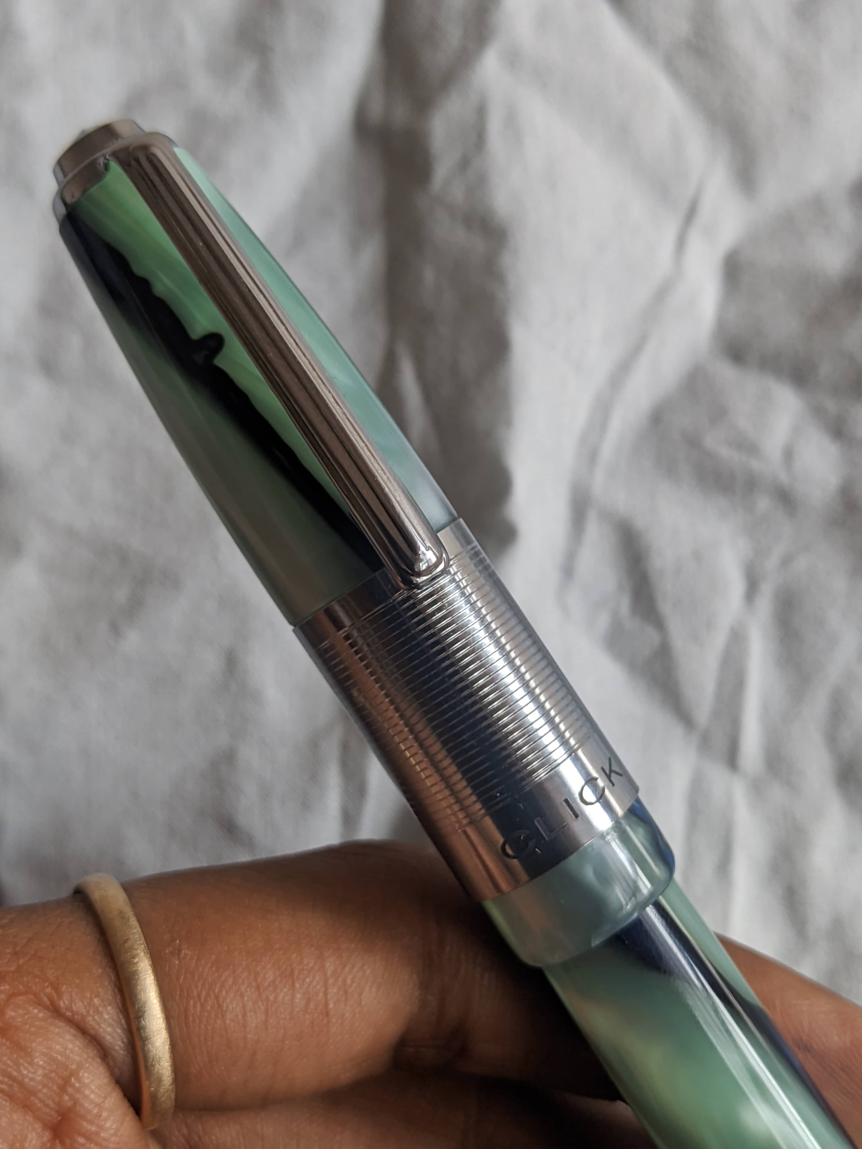
Starting from the top, we see a silver finial with a conical end and a chamfer going transitioning into the clip, which in airmail tradition is short and thin, which covers half of the cap. It's a bit stiff, but functional. the cap is made of acrylic, and tapers up before transitioning into a wide cap band, with a horizontal pattern and a laser engraved click logo in the bottom,. A small section of the acrylic is then exposed to the bottom with a medium step-down to the barrel.

Image Description

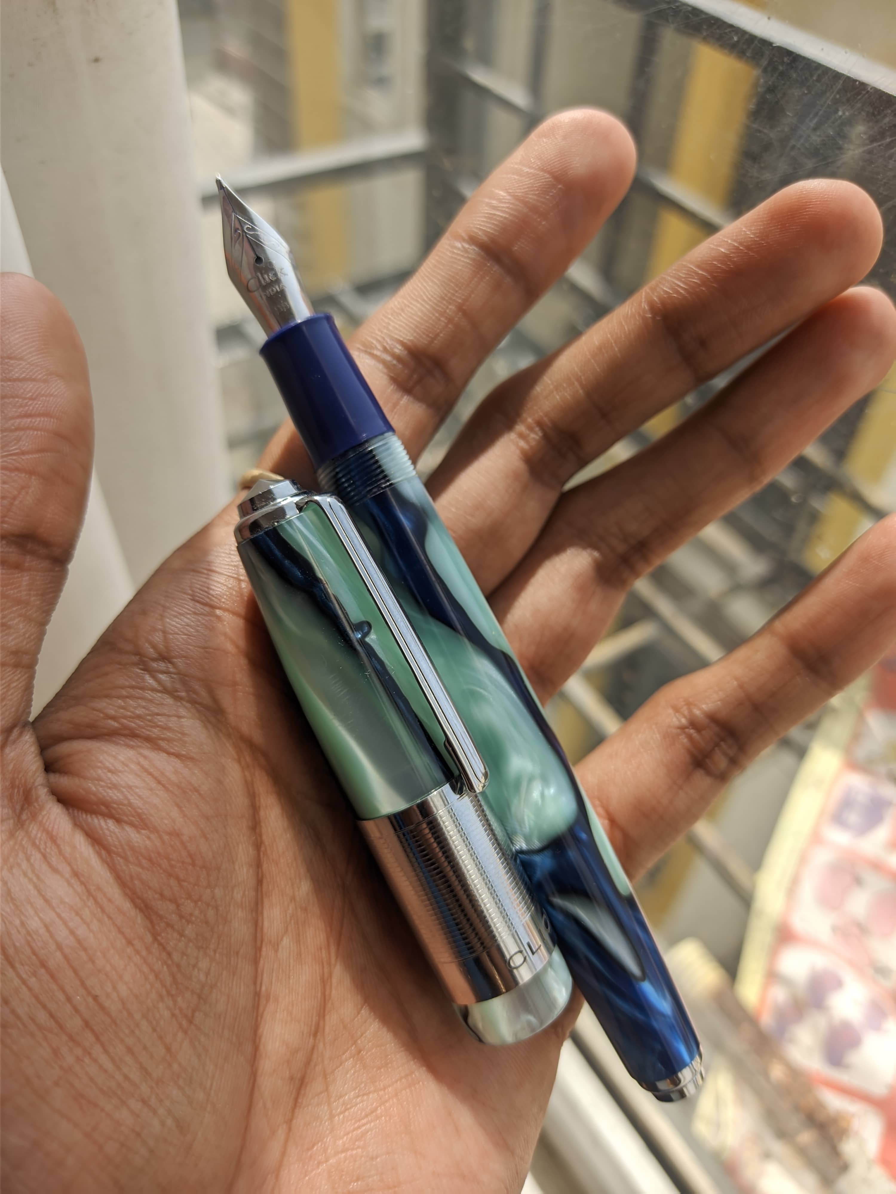
Coning to the barrel, let's start from the back where we find the same finial as in the cap, with a metal band to maintain that symmetry, which then transitions to the long acrylic barrel, which tapers up till about halfway, then tapers back down to merge with the section without any step down. The threads are quad-start and are nice and smooth, if you tend to hold the pen a little further away from the nib, the smooth transition along with the clean threads offer a nice place for you to hold the pen.
I've went for the white and blue color variation, which feels more of a light green and blue to my eyes. They do have other color options including a green and blue option as well, though I personally think the plain black or white colors with the thin striping looks particularly good.
Coming to the section, it's a short section with a small taper, and a miniscule flare out towards the end. The section is not made with the same acrylic. Rather, the same kind of plastic used in their models like the aristocrat, and is compression molded.

Image Description

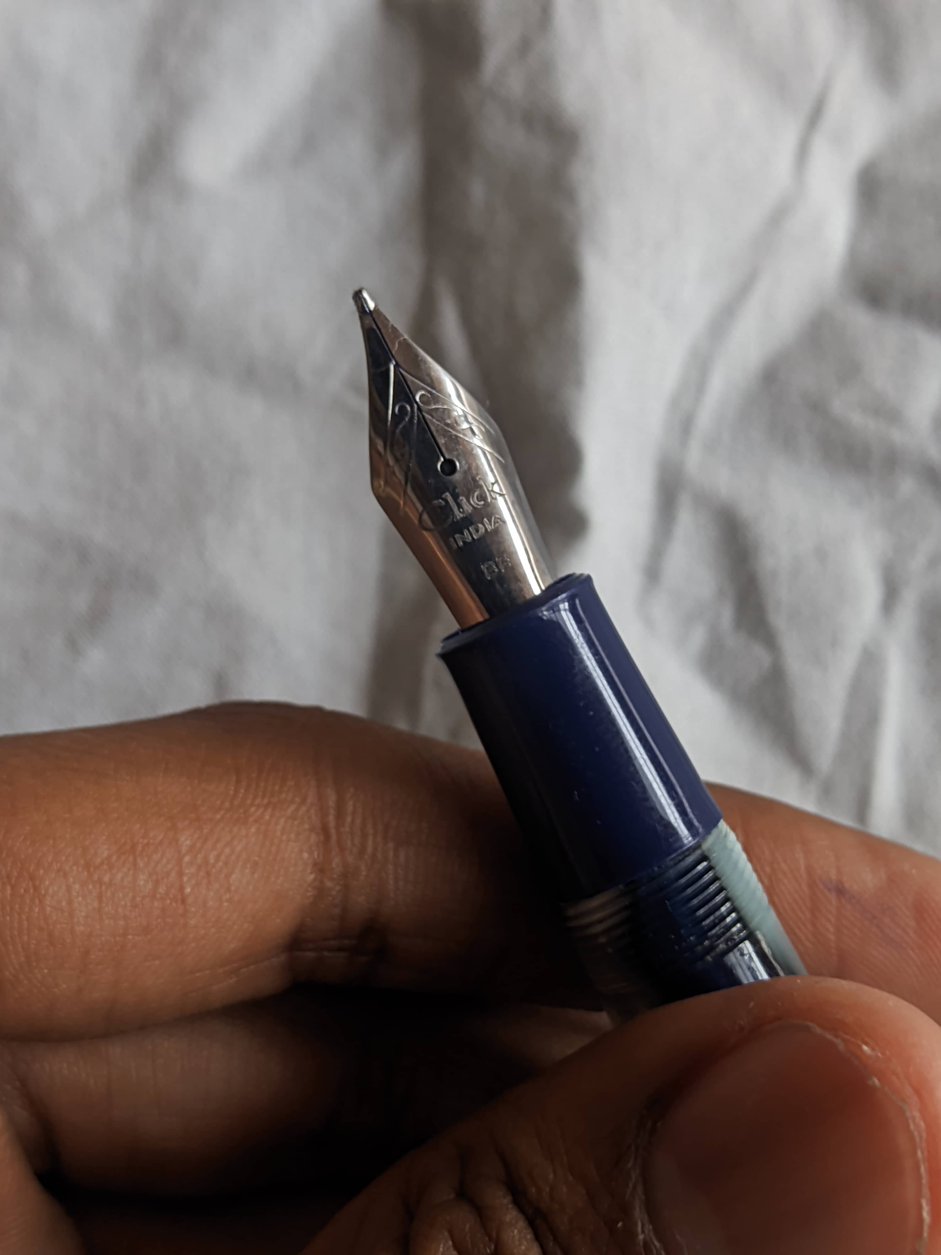
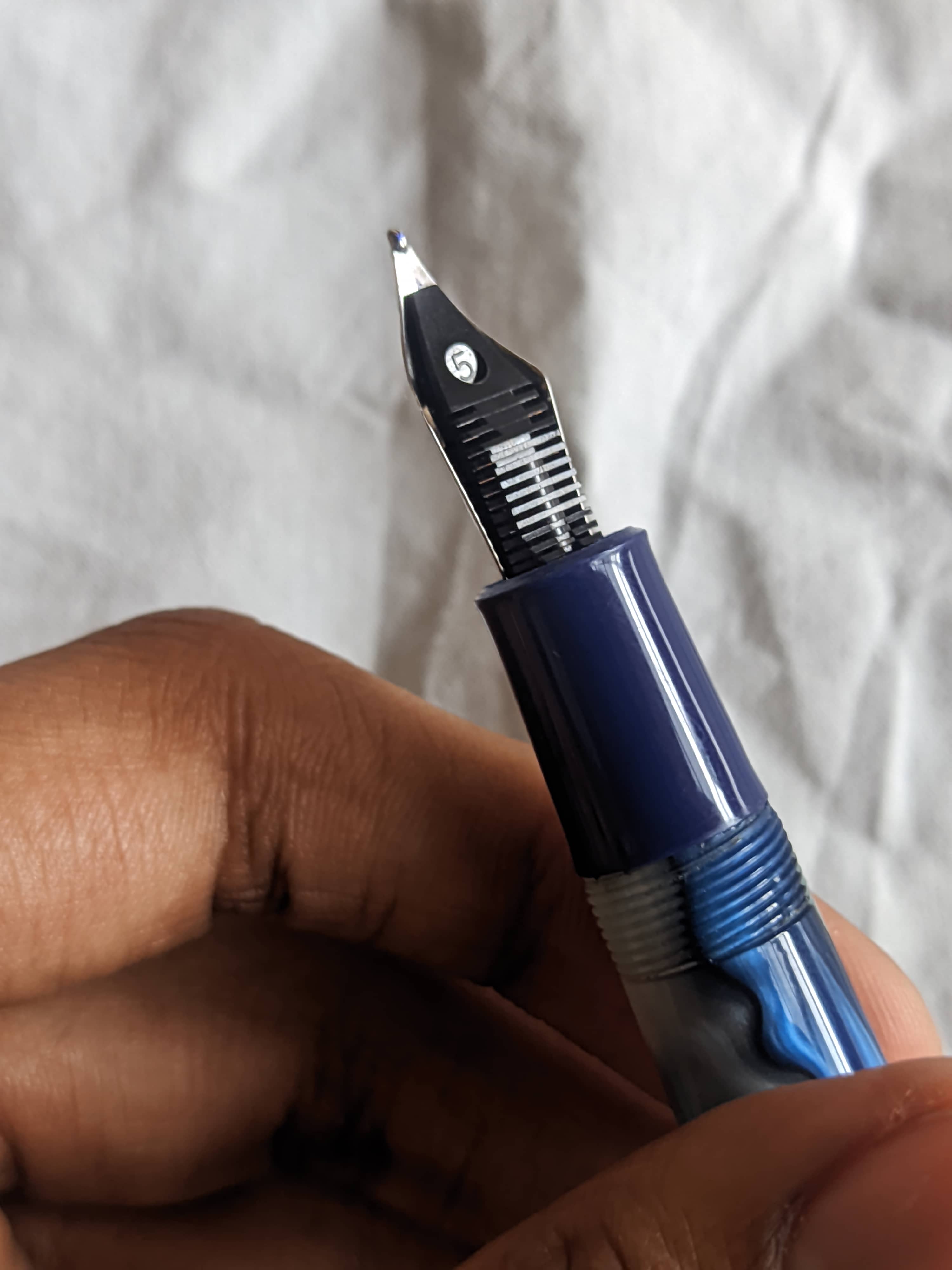
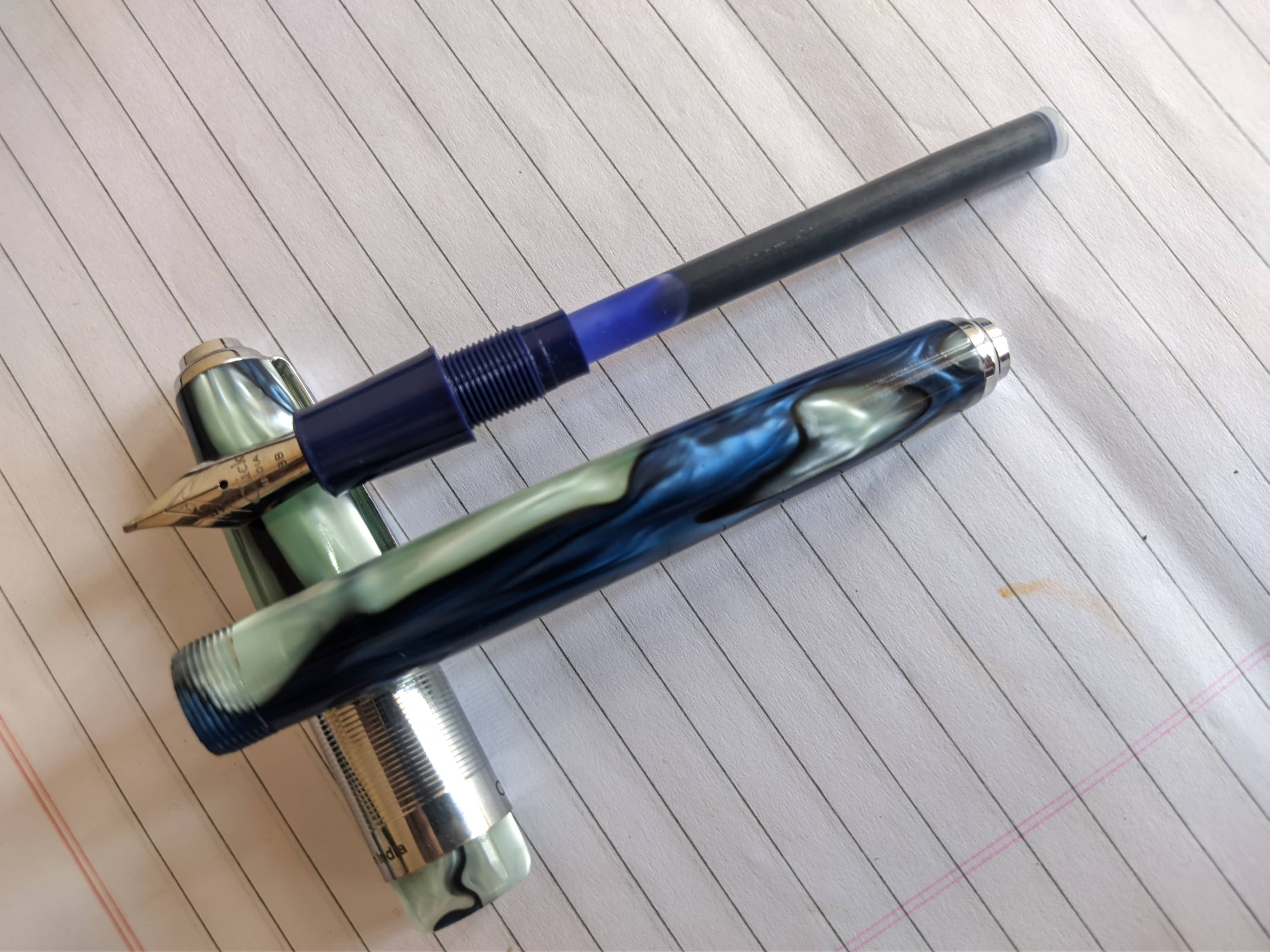
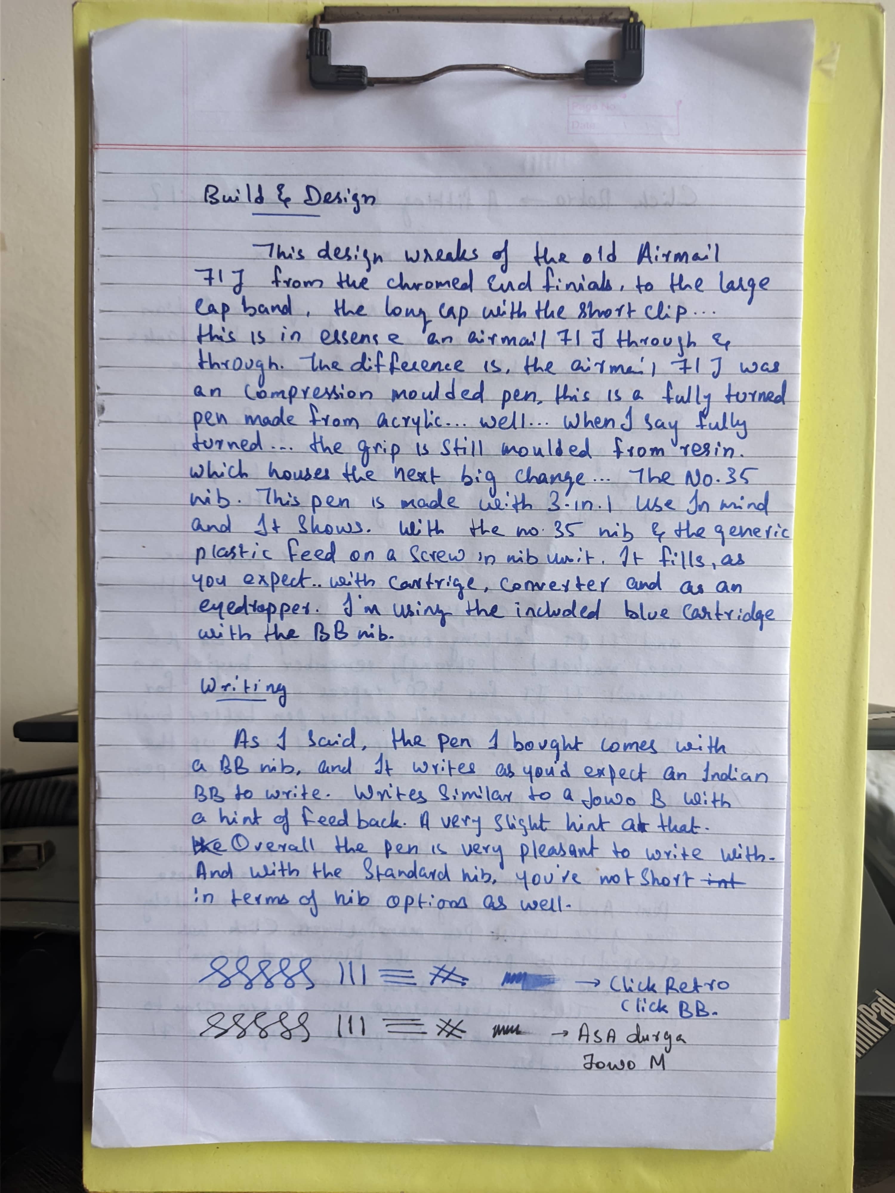
Then we come to the nib. This is where this pen differs from the airmail. As while the airmail had an Indian #8 nib friction fit over an ebonite feed, this pen uses a Indian #35(International #6) nib on a nib unit and a plastic feed.

Image Description Image Description

This allows for the use of a cartridge/converter alongside the typical eyedropper mode, since there are enough threads in the section that with an appropriate amount of silicone grease, you can ensure a leak free eyedropper experience. It'll write a bit wetter too if you're going to go full ink tanker on it.

Image Description

Overall, as for design, they've went for the Airmail 71J look. And this is why I said Click mostly solved the problem in the intro. If they've made this with clear acrylic and made it look like the 71JT demonstrator, I think we have a winner here.

As for the size, it's a medium-large pen, here are the measurements. Measurements: - Capped: 151.3mm - Uncapped: 134.9mm - Thickness of the barrel: 13.2 at the thickest and 11.0 at the thinnest - Barrel wall thickness: ~1.8mm - Cap thickness: 16.0mm - Section dimension: 11.4mm tapering to 10.2mm over a length of 17.5mm The dimensions are bang on with the Airmial as you can see from the size comparisons. From left to right, we have: - Click Retro - Airmail 71JT - Airmail71J - Kanwrite Desire - Gama Forever Image Description Image Description

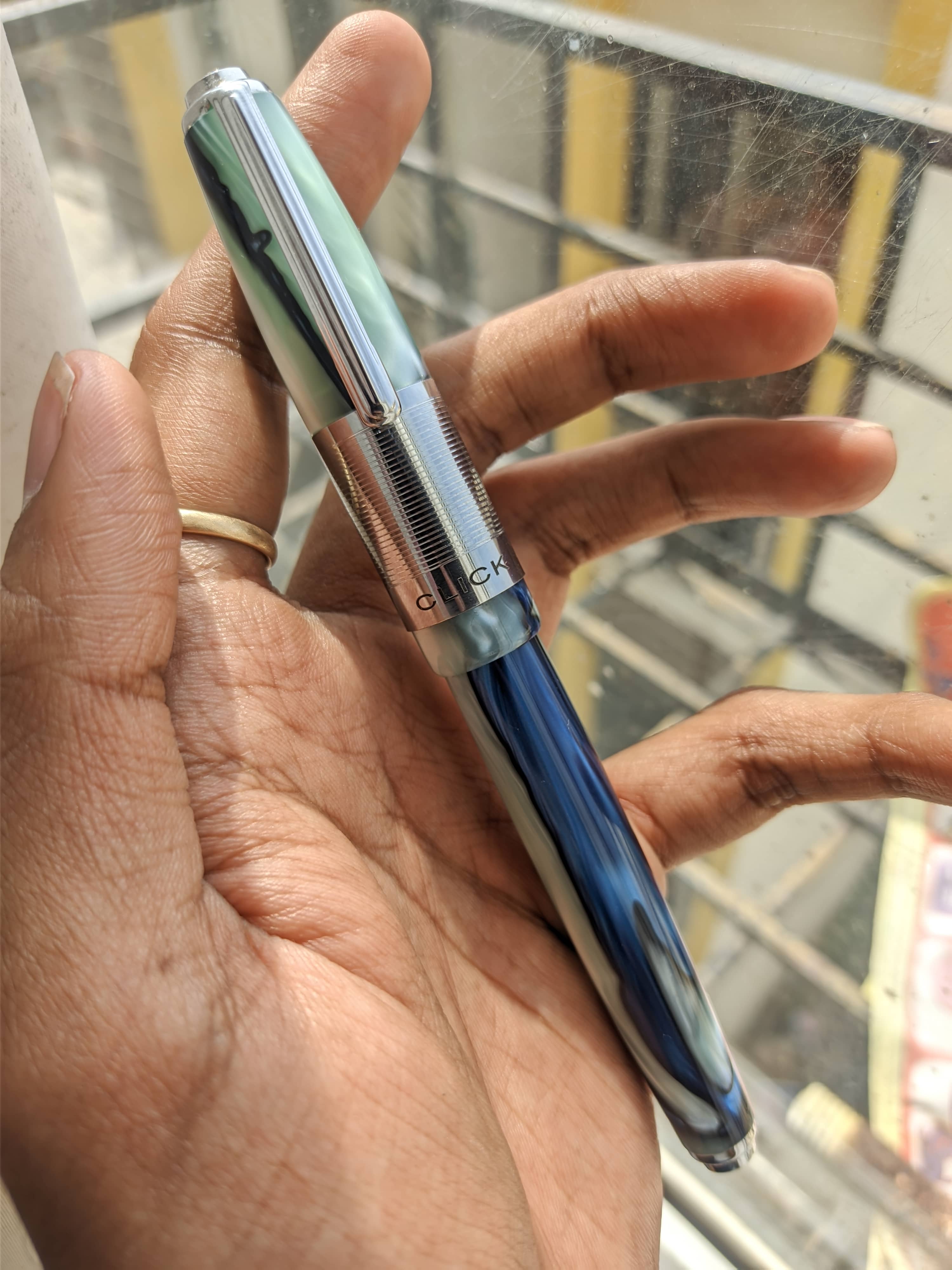
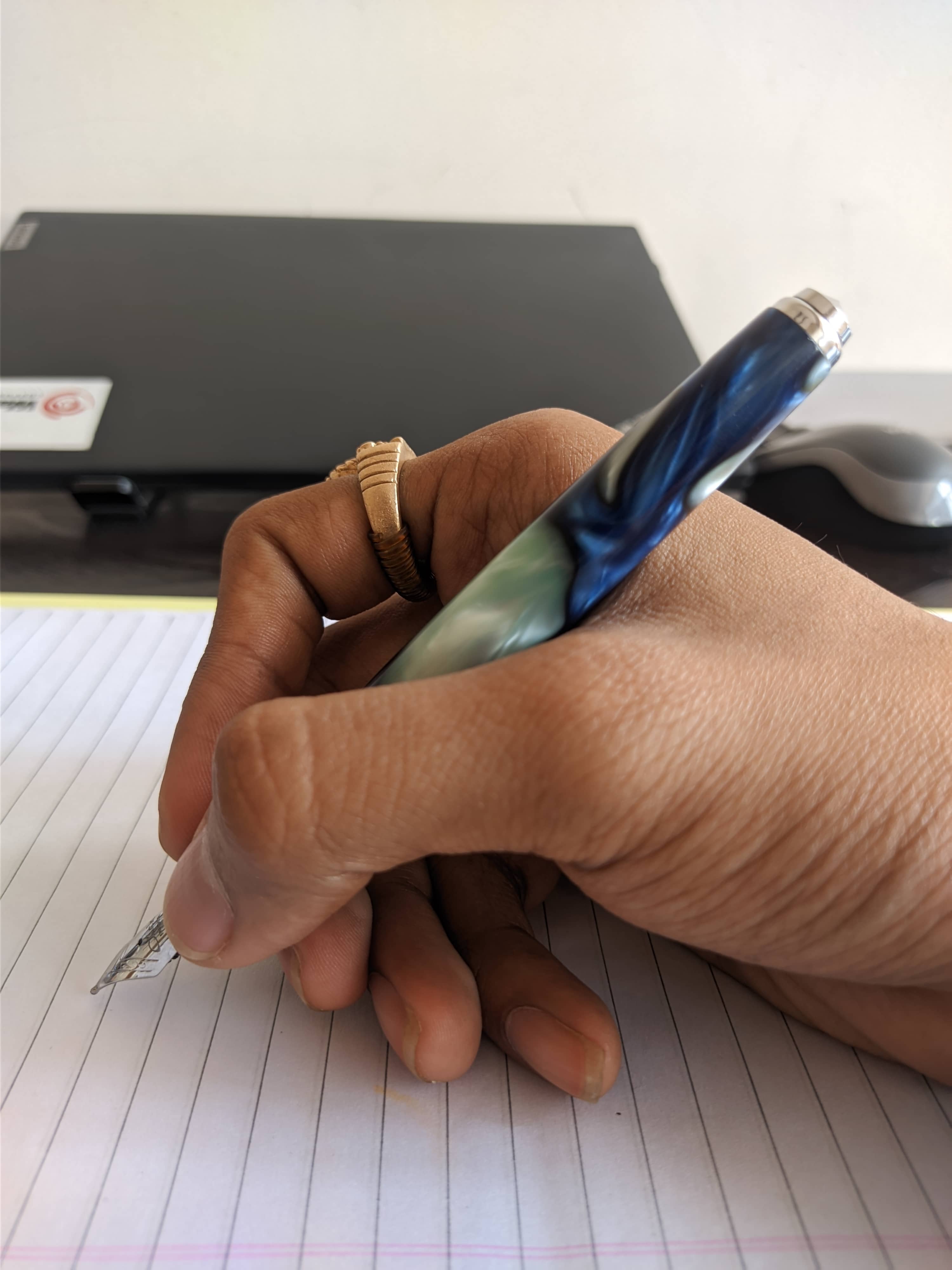
In hand, you'll get an idea on why the airmail 71s were popular in the pen community, for a pen of this size, it is very comfortable and unposted, the length is just right as well, for me at least.
Image Description

Writing Experience

The click retro is available with nib sizes ranging from extra-fine, all the way to double-broad. I'm more of a fine nib kinda guy, but for this one I decided to go with a double broad. the nib is engraved with the click logo(which I think is made by Kanwrite, looking at the stamping). For the ink, I just used the long blue cartridge that came along with the pen, since I was too lazy to choose an ink for it. Coming to writing with it, on the upside, It's an extremely smooth nib, with good flow despite the plastic feed, and keeps up with normal and fast writing. On the downside, my nib came with a bit of baby's bottom, which is a common occurrence with broader nibs in my experience(or I'm just not that lucky) leading to hard starts, but once the ink gets flowing it just flows.... I eventually fixed the baby's bottom using a #7000 grit sandpaper, which solved the hard starting, while maintaining the smoothness of the nib.

Image Description Image Description

I do like how the nib writes, however, I might just roughen the tip just a bit with something like a #4000 grit sandpaper, just to give a bit of feedback because as of now the pen is so smooth for my taste that I'm not getting that much control in writing with it. So if you like glassy smooth nibs, go for the double broad. Just keep in mind, you might or might not have a slight baby's bottom that causes hard starts. And since it's a standard #6 / #35 nib, you have plenty of options regarding nib swaps. Just pull the nib and feed out and swap with your choice of nibs, go for a Kanwrite nib in the standard sizes, or go for their specialty grinds like obliques, architects, stubs, etc. Or if you're fond of ze Germans, put in a JoWo or a Bock nib in it. It's this level of customizability that is great with these pens.

Verdict

There is nothing much to say here, it is a great performer and a good value for money. If you want a pen with a good build, versatile filling options, a great nib and that classic look, then this pen is a great option, and for those who want to experience the flavor of airmail but are not ready to pay for it, or you're apprehensive to but because it's an eyedropper only pen, then this pen does present a solid case for itself at ₹900.